What Every High Converting Landing Page Has + 6 Examples

Sometimes low conversion rates aren’t the outcome of poor landing page design or weak copy but of a deeper market fit challenge.
Now, if you have initial sales traction and statistical significance, the gap between your landing page performance and a high-converting landing page often comes down to specific, learnable principles.
What is a high-converting landing page?
Simply put, a high-converting landing page is a standalone web page specifically crafted to turn visitors into customers or leads through a single, specific action. It focuses 99% on conversions.
As the name suggests, the “high-converting” part refers to how good (or above average) the landing page performs at making people buy, subscribe, download, or book services/products.
The best landing pages follow most (if not all) of these patterns:
- Clear headline with value prop. Identify your target audience, promise a specific benefit, and hint at the transformation you offer. Someone should understand what you bring to the table even if they’re half paying attention.
- Benefit-led messaging. This represents the psychological shift from seller-centered to buyer-centered communication. Features describe what your product does, benefits though explain exactly what that means for the potential customer.
- Single, big CTA. Your call-to-action should dominate the visual layout/structure through contrasting colors, generous white space, and strategic placement above the fold and at natural conclusion points in the landing page content.
- Intentional design. Human eyes follow predictable patterns when scrolling, moving in a Z-pattern or F-pattern. Size, color, contrast, images, typography, and space all serve as visual cues to guide visitors through your narrative.
- Social proof. For risk mitigation, other people’s experiences (testimonials, reviews, stories) show evidence that a product and service can deliver what it promises. It’s a way to strategically create credibility through association.
- Trust signals. “Is this legit and safe?” To address the subconscious question, trust signals work on multiple psychological levels, from recognition of security badges to subtle demonstrations of professionalism and competence.
- Friction reduction. Every additional step, form field, or piece of required information creates a hurdle that naturally some % of visitors won’t pass. Like lengthy forms, required account creation, unclear pricing, or complicated checkouts.
- Urgency or scarcity. Psychological triggers of loss aversion that generate a sense of now-or-never momentum. It must be authentic. Otherwise, false scarcity may damage brand trust and potentially violate consumer protection laws.
For example, a simple product might need just the headline, imagery, benefits, and an obvious CTA. An enterprise might need the full toolkit with extensive testimonials and detailed trust signals.
The magic happens when these components reinforce each other. Your headline pulls people in, your copy builds desire, social proof manages objections, and the CTA feels like the natural next step.
Qualitative consensus. What is a good conversion rate for a landing page?
Based on Unbounce’s 2024 Conversion Benchmark Report that collected the analysis of +41K landing pages, +464M unique visitors, and +57M conversions, a “good” landing page conversion rate is >6.6%, which is the median conversion % across industries.
There’s nuance to it, however. As you can see in the table below from the same Unbounce research data, 5% median conversion rate would be considered not so bad for SaaS companies but at the same time not so ideal for commercial and professional services.
*The median percentage (%) is the exact middle point when you list numbers from smallest to largest. It’s a measure of central tendency to find what’s “typical” because it doesn’t get pulled around by outliers (much bigger or much smaller numbers than the rest).
A word to the wise: Context matters. Purchasing power, cultural expectations, and local market conditions affect what converts. Local chambers of commerce have regional market data that may get you interesting insights about what works in specific areas.
6 High-converting landing page examples
Here’s what real high-converting landing pages may look like:
1. Basecamp – Project management tool for SMBs

Why this high-converting landing page example works: The opening visual chaos with scattered app icons and frustrated team quotes (“Wait, when is this due?”) triggers recognition in prospects struggling with tool sprawl and communication breakdowns.
Basecamp reframed the category around simplicity vs. complexity, positioning the brand as the “refreshingly clear” alternative to “overwhelming, inadequate, bewildering, or chaotic” competitors.
Every feature gets screenshot references showing actual workflows, making benefits tangible rather than abstract. The “Let’s walk through it” section guides prospects through real scenarios.

The “It’s time for Basecamp” messaging creates momentum toward action while the “you wouldn’t be here if the way you’ve been working was working” logic makes switching feel inevitable.
Did I mention the capabilities list and FAQ sections that eliminate friction, and the “Over 30 pages of customer testimonials” that gives credibility reassurance without overwhelming the main narrative?
High-converting landing page elements I like from Basecamp:
- Lead with vivid pain/frustration visualization
- Weave testimonials and usage stats throughout
- Visual product demonstrations beat feature lists
- Address objections preemptively with a solid FAQ
2. Mullvad – Privacy-focused VPN and browser

Why this high-performing landing page example works: It leads with mission-first messaging, “Free the Internet” highlights ideology over product features. And privacy advocates buy into movements.
Mullvad’s values-aligned onboarding demonstrates commitment in practice, asking zero personal information for signup. It proves the brand’s privacy stance is genuine rather than marketing speak.

Besides, the transparent simplicity of the company pricing model (fixed €5/≈$5.73 since 2009) and straightforward 3-step setup builds trust through predictability. The authentic, mission-driven positioning resonates with the privacy-conscious demographic.
High-converting landing page elements I like from Mullvad:
- Appeal to beliefs/values before showcasing capabilities
- Make the signup process embody your core promise
- Unchanging rates demonstrate reliability and fairness
- Position as authoritative educator. And not just vendor
3. Cotopaxi – Sustainable outdoor apparel brand
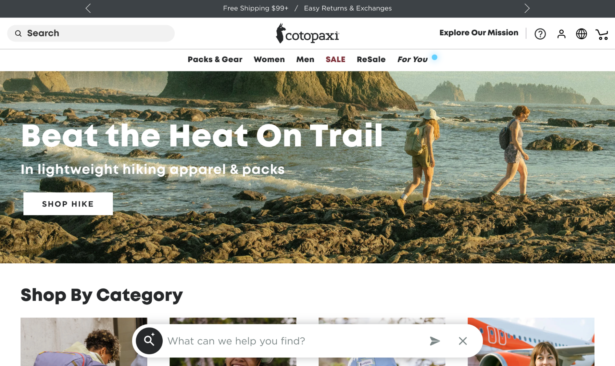
Why this high-converting landing page Shopify example works: The purpose-led approach helped Cotopaxi achieve a 50% increase in revenue and 40% increase in average order value, as customers connect emotionally with the brand’s poverty alleviation mission.
When it comes to personalized product discovery, Cotopaxi’s “Complete The Look” recommendations resulted in a 13.67% increase in conversion rate and 21.87% boost in revenue per visitor The store has traditional categories + adventure-based collections.

Have you noticed how the hero section uses outdoor imagery that’s seasonally relevant? It captures spring/early summer vibes with coastal hiking scenes, though this likely rotates to match seasonal buying patterns throughout the year. This keeps Cotopaxi relevant.
The page builds trust through multiple layers: “Guaranteed for Good” messaging, lifetime warranty, easy returns, and trade-in programs that address purchase hesitations. And for high-ticket items, the brand uses user-generated content to lift conversions.
High-converting landing page elements I like from Cotopaxi:
- Purpose-driven messaging. Lead with mission/values
- Offer traditional categories and lifestyle-based collections
- Warranties and easy returns eliminate purchase hesitation
- Personalized recommendations with DynamicYield’s AI
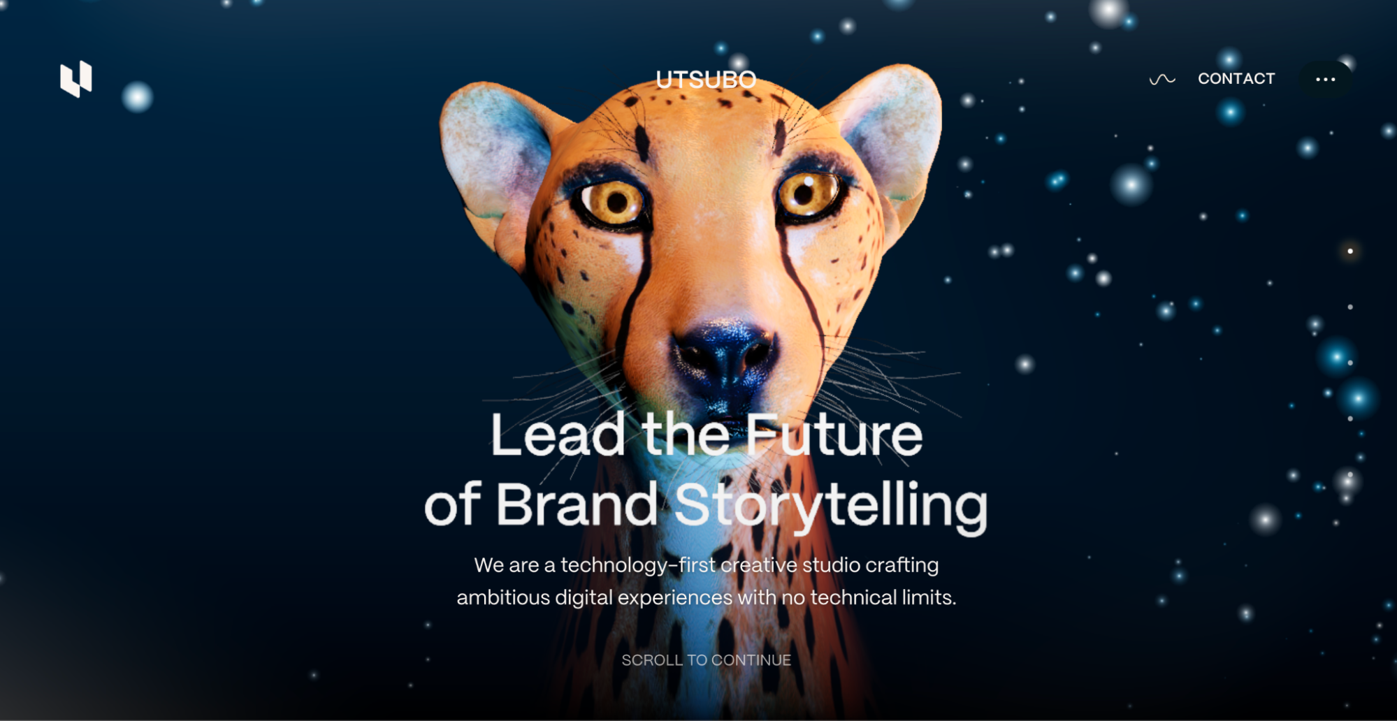
4. Utsubo – Creative 3D animation studio

Why this high conversion landing page example works: Utsubo’s landing page works because it demonstrates capability through experience. What is that? Credibility through product-as-proof.
The WebGPU animation complexity acts as a filter. Brands needing basic web work bounce off, while clients wanting “out-of-this-world experiences” connect. The friction is intentional and valuable.
Authority positioning comes through displays of expertise without overselling. Awards from FWA, Awwwards, and Webby establish credibility, while technical language reinforces the Utsubo “technology-first creative studio” positioning in a differentiated way.
Believe it or not, the conversion process matches the nature of the service offering. Just email and scheduling options. No forms or demos with sales reps. It reduces barriers to initial contact, which is pretty much how sales of high-ticket creative work happens.
High-converting landing page elements I like from Utsubo:
- Show capability through interactive demonstration
- Use strategic friction to pre-qualify prospects
- Lead with positioning that differentiates the brand
- Simple email contact or call link for complex services
5. The Onion – Satirical news membership

Why this successful landing page example works: The Onion leans into a positioning that makes The Onion special instead of trying to look, sound, and be like every other boring newspaper out there.
That $99/12 issues deal grabs attention and dominates the visual space, but notice how the $365 CTA button gets the green highlight treatment? Yeah, classic nudge toward the higher-value tier.

And the copy balances The Onion’s signature satire with the benefit of exclusive content. Straightforward value with all the personality I don’t have. Simple form, transparent pricing, and nostalgic vibe.
High-converting landing page elements I like from The Onion:
- Authentic counter-positioning with physical newspapers
- $365 green CTA says “this one” without screaming it
- “Rise to power” sounds cooler than “newsletter access”
- Friction removal through obvious signup form simplicity
6. Mercury – Financial technology subscription

Why this high-converting landing page example works: It leads with a concrete “4.00% APY” benefit. And simultaneously, the “waitlist is open” messaging drives the kind of scarcity that makes people feel they’re getting early access to something exclusive.
Mercury structures the landing page brilliantly, moving from the hook (high APY) to feature explanations. It addresses different user needs systematically—savings growth, investment options, joint accounts, and automation features. The progression feels natural and builds a complete picture of the brand new Mercury offering.
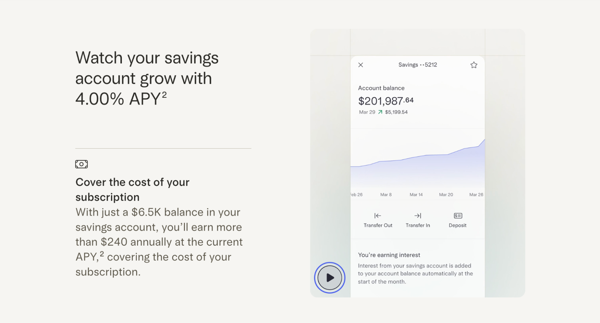
The page reiterates FDIC insurance ($5M vs. industry standard $250K), includes regulatory disclaimers, and gives detailed pricing ($240 annually, no hidden fees). The testimonial from a CEO adds credibility. This transparency helps overcome fintech skepticism.
Rather than just listing features, Mercury shows app mockups and interactive elements. The savings growth visualization and transfer interface screenshots help users envision actually using the product.
High-converting landing page elements I like from Mercury:
- Clear and strong value proposition in the headline
- “Waitlist”messaging creates urgency and exclusivity
- Layer information from hook to detailed features
- Trust signals throughout. Like FDIC insurance details
High-converting landing page framework
While the layout of each high-converting landing page varies by product, service, and audience, the core remains consistent.
Hero section with clear value prop and a main CTA. Social proof that builds credibility. Benefit-focused sections that connect features to outcomes your audience cares about. “How it works” explanation for complex products. And a final conversion push for urgency.
Emily Kramer’s wireframe from MKT1 illustrates this anatomy:

Every element on your landing page should either move visitors closer to conversion or be removed. Start with one clear goal, eliminate everything that doesn’t serve it, and A/B test the rest.