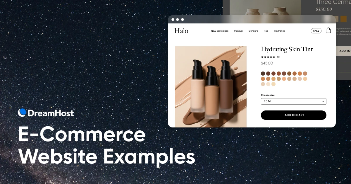
12 E-Commerce Website Examples (You Haven’t Seen a Million Times)

Social proof.
Sustainability.
Trust and education.
What do all of these things have in common?
They’re all traits of today’s best e-commerce sites. Ones that don’t just look great, but also convert.
If you’re in the midst of pulling together an e-commerce website for your small business, you don’t have time for a bunch of out-of-context tips or the same old recommendations to copy massive brands.
Instead, the following fresh, steal-worthy examples prioritize aesthetics and beyond to show you exactly how real companies like yours are building beautiful online stores that win clicks, purchases, and long-term loyalty.
12 Stunning E-Commerce Websites for Real-World Inspiration
Tired of seeing the same old brands in every “best websites” roundup? We’ve got you.
These standout e-commerce sites, mostly from smaller brands that are more like yours, don’t just look great — they sell smarter.
From sustainability storytelling to trust-building in the AI era, these fresh picks show exactly how to win modern shoppers and boost conversions without sacrificing style.
Cashing in on the sustainability trend
You’ve likely seen the writing on the wall —more and more companies are investing in sustainability.
Why?
Because trends indicate that, already, about 25% of shoppers make purchases based on retailer sustainability practices, and that percentage is expected to continue to grow as the younger consumers who show a penchant for eco-friendliness mature in the workforce and increase their buying power.
And of all the ways consumers use to find out how sustainable products are, a brand’s website is their number-one indicator.
Yet, Baymard found that a whopping 25% of websites don’t even bother to highlight their sustainability features.
If you’re among that number, these first e-commerce website examples will show you:
- A few different approaches you can take to sustainability, if you haven’t gotten that initiative off the ground yet; and
- How to seamlessly integrate them into your website in a (non-dorky) way that doesn’t sacrifice design at all.
1. agood
agood is a Certified B Corp. that turns a typically wasteful industry on its head by producing more eco-friendly phone accessories, drinkware, and more.
And they do it all with a website that isn’t only visually stunning, but that effectively positions their products right alongside the story of their mission, creative supply chain solutions, charitable donations, and circularity efforts.
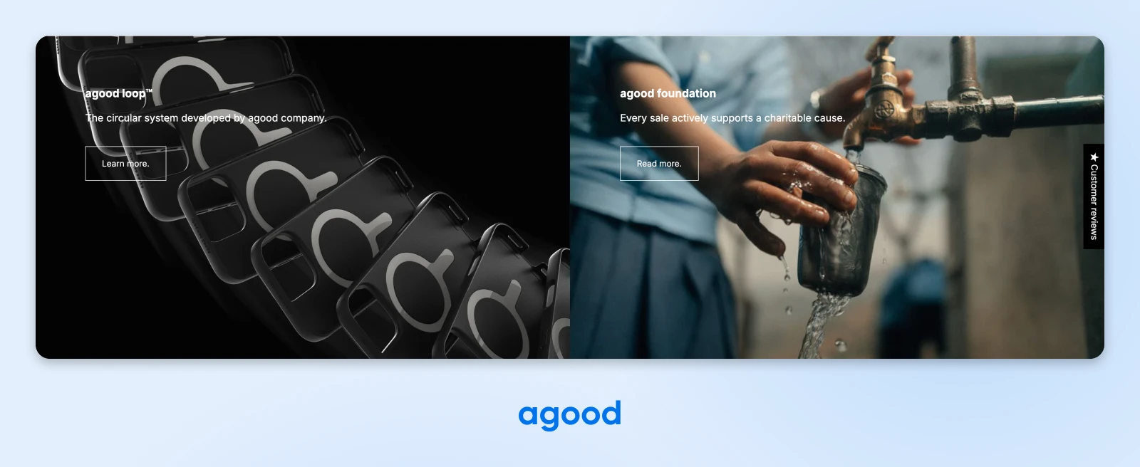
agood offers up a good (pun intended) example of how any e-commerce website can marry their mission with their products in way that speaks to the growing sustainability-obsessed segment while still catering to shoppers who aren’t yet on that journey.
2. ILIA Beauty
It’s no surprise that ILIA Beauty’s website is as streamlined and beautiful as their products themselves.Their approach to informing shoppers about their sustainability efforts is simple — they just chuck the necessary info right into their product shots.
As you’ll see on this product page, the brand just added their “1% for the Planet” badge to the first picture of the product.
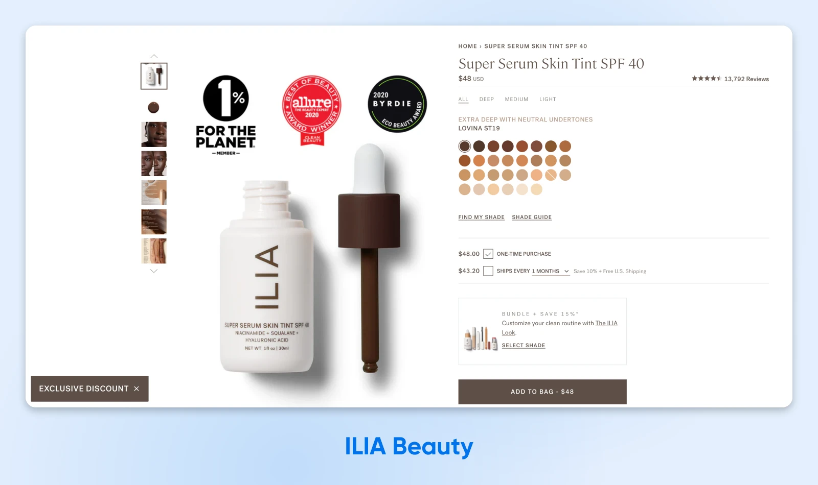
It’s simple, it’s impossible for consumers to miss, and it’s a quick solution that’s nearly impossible to mess up from the brand’s perspective.
ILIA proves that great e-commerce design isn’t always about developing a deep design philosophy and adding complicated coding features — sometimes a quick photo edit is all you need to get your point across in a beautiful way.
“I like the 1% for the planet. Sustainability is important to me. So that’s cool.” — Baymard usability testing participant
Boosting engagement through education
Nearly 70% of consumers told Accenture they would actually engage more with a brand if it made an effort to educate them —especially using resources like blogs and videos.
It couldn’t be any clearer: effective e-commerce sites prioritize informing visitors about their products and how to use them.
The following examples show how brands in two different industries take two different approaches, both of which deliver education in a way that’s perfectly engaging for their target audiences.
3. Onyx Coffee Lab
Have you ever met a serious coffee drinker?
The creators behind the Onyx Coffee Lab e-commerce site clearly have.
Why do we say that?
Because they know that coffee heads love to learn about the provenance of their beans, and they capitalize on this fact by diving right into educating visitors right on their home page. In addition to some great background info on one of their producers, they also share a link to classes where visitors can learn about and up their coffee-making skills.
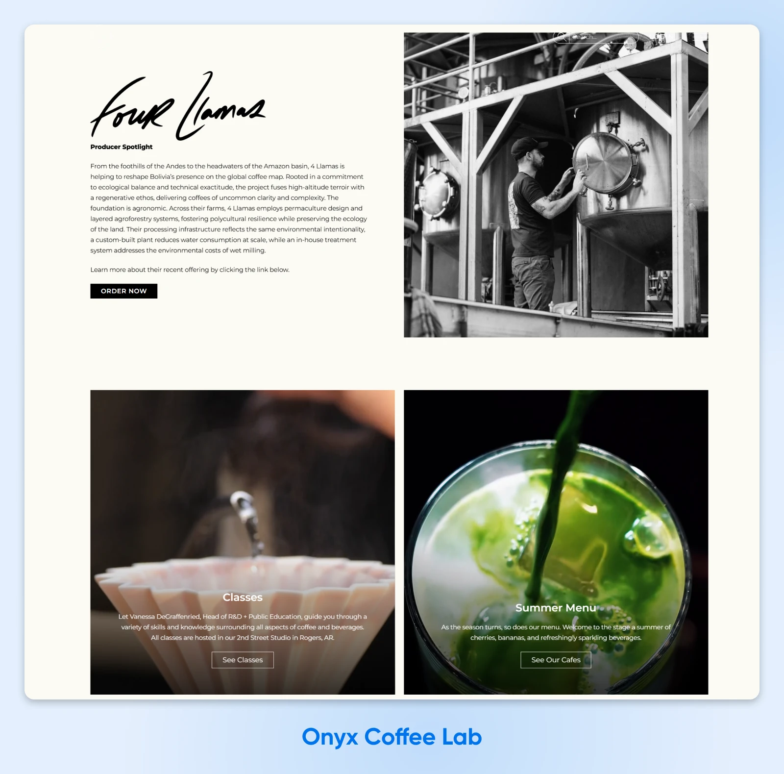
This 2025 Webby Winner shows how educational opportunities don’t have to be boring. They can live right alongside and even enhance your killer branding and design. (Seriously, we recommend visiting the site to check out all of the design elements we couldn’t cover here.)
4. Olive and June
Thanks to e-commerce brands like Olive and June, you don’t have to rely on a salon to beautify your nails. Instead you can learn to develop the skills you need to do it on your own, with help from their Olive University.
This aptly-named page of their website both aligns with their branding while also streamlining the steps and information visitors need to know to pull off an at-home mani.
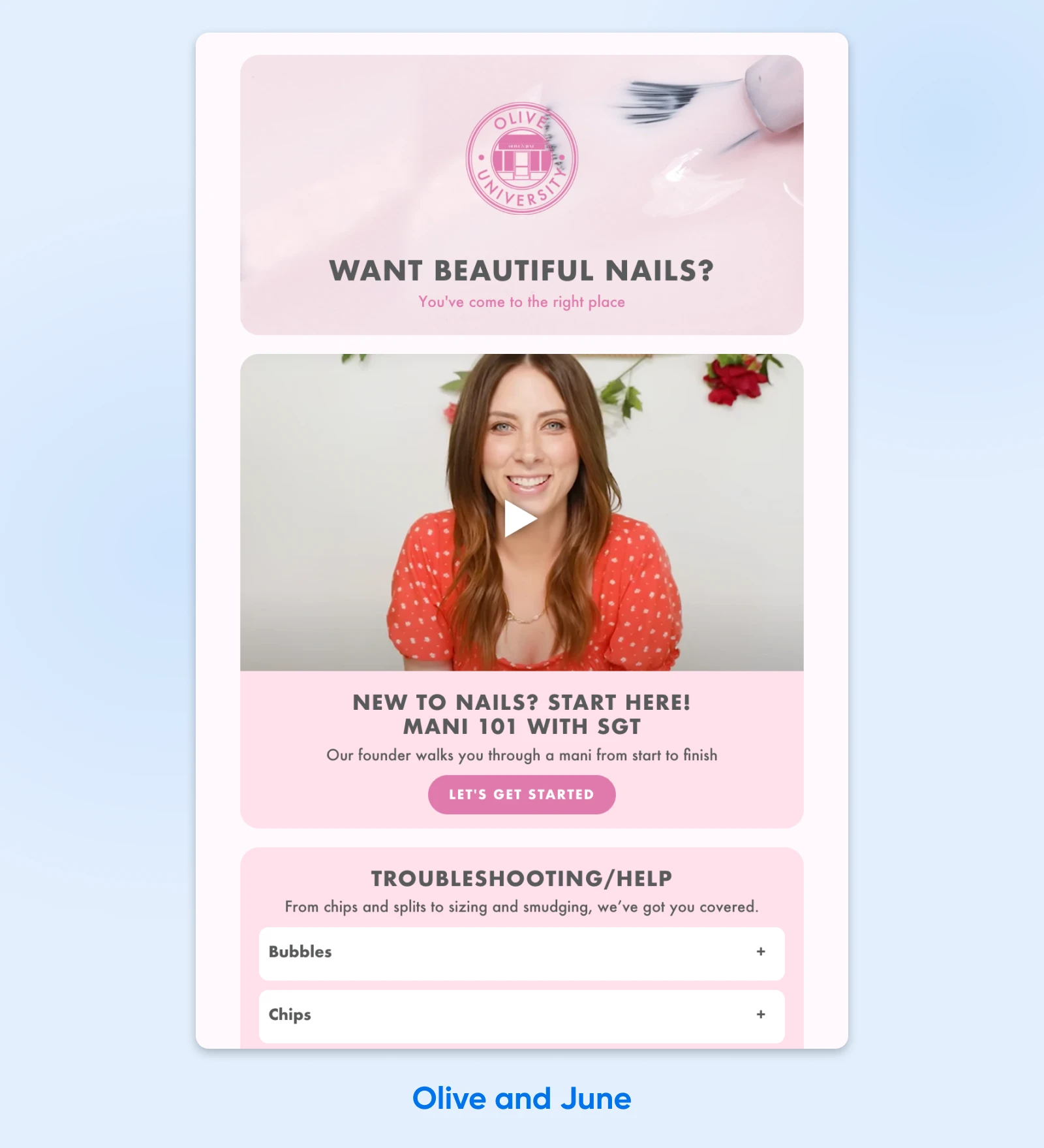
Especially for smaller or newer businesses that might not have a solid reputation yet, educational information can entice more visitors, keep them on your site for longer, and naturally inspire them to pick up some of your products to act on everything they’ve just learned.
Creating trust in the age of AI
There’s no doubt the age of AI is upon us. (Psst…have you heard of our AI-powered Liftoff AI Website Builder?)
In this burgeoning environment, consumers are understandably relearning how to tell what to trust online and what isn’t as real as it seems.
In fact, 60% of people surveyed by Accenture admitted to questioning how authentic online content is recently.
One of the best ways e-commerce brands can create trust and ensure authenticity among consumers is by enabling other real-life consumers to show off their interactions.
Next up, two examples of e-commerce websites that smartly empower happy consumer experiences to help build trust and increase conversions.
“Personally, I find fake pictures or videos on the internet very unacceptable. Even though the internet is a virtual environment, virtual does not mean fake.” — YK Zhang, Accenture Life Trends 2025 report
5. Fabletics
For a fabulous example of a retailer creating instant trust, we can turn to the “AS SEEN ON YOU” section that Fabletics features on its product pages.
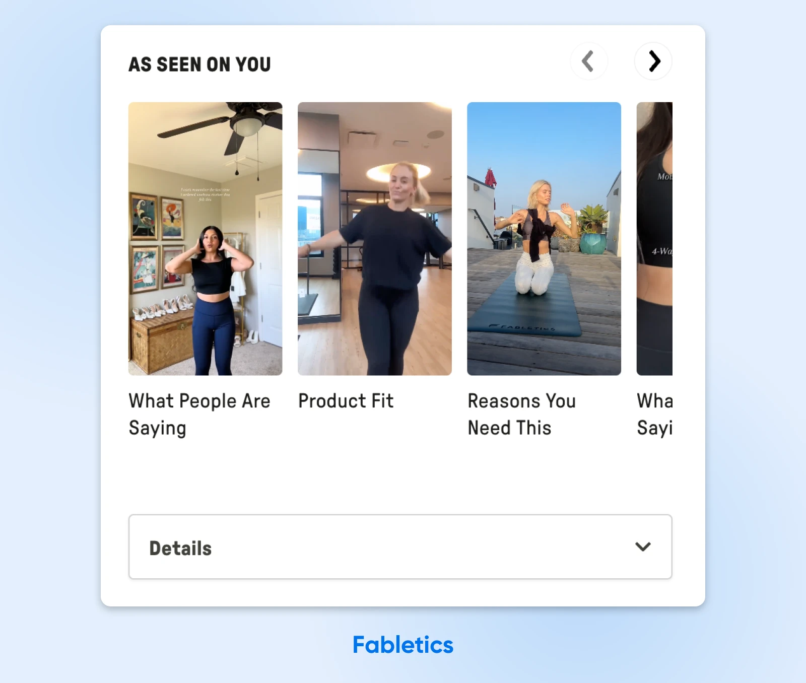
This element is featured right alongside the brand’s professional product shots as part of the purchasing flow, a wise design that may help seal the deal for shoppers who are doing just a *bit* more research before hitting that buy button.
There are no AI-enhanced reviews or images to lean on here, just real videos from actual, trustworthy people engaging with and loving their products.
6. Albany Park
Albany Park’s product pages are beautifully done.
Perfect product shots, elegant design, and tons of details and benefits statements already make it a stand-out example for any e-commerce website beginners out there. However, it’s the reviews that really hammer home that this is a trustworthy brand.
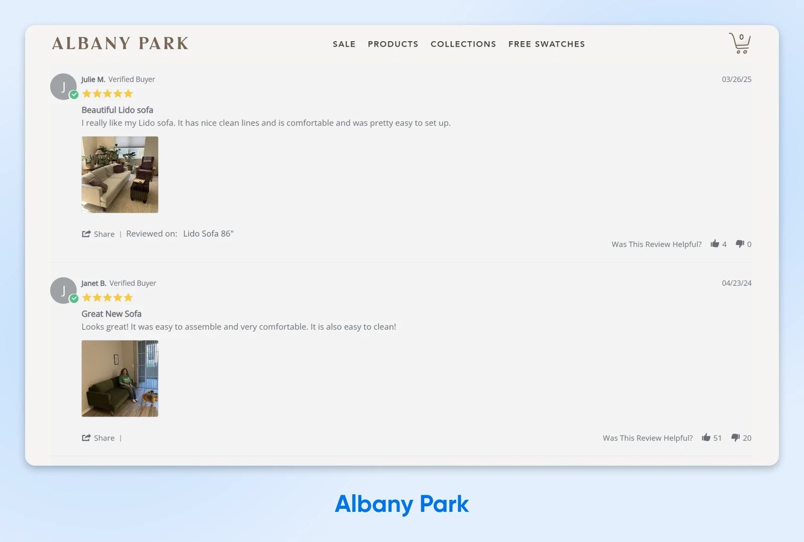
Albany Park makes it easy for reviewers to include a shot of their new furniture in action in their own homes. This instantly makes the happy reviews feel real. You’ll also notice there’s no “leave a review” button on this page. Meaning that only actual buyers who are sent a post-purchase review link are able to write one. This further helps solidify that the reviews aren’t submitted by bots and can be trusted.
Social media reviews and more enriched on-site user reviews are two totally achievable design elements that can make e-commerce websites even more trustworthy in a time when consumers need to question everything.
Letting (great) reviews speak for themselves
T-shirt on the rack? Meh.
Seeing that same t-shirt on that impossibly cool acquaintance with great style you’ve always kinda wanted to emulate? SOLD!
There’s just something in us that makes us more likely to trust and desire products that others love, and that feeling only amps up when products are also backed in a more official capacity through media mentions and badges from related associations.
This phenomenon is called social proof, and the next few examples will show you how easy it can be to bring it to life on your site.
7. Tropic Skincare
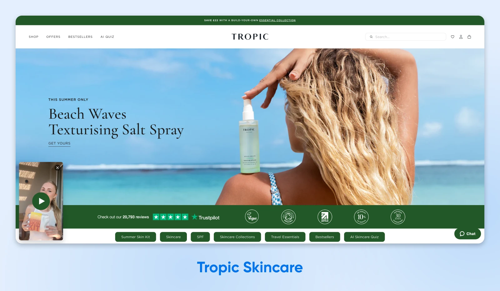
Tropic Skincare clearly knows the power of providing social proof via reviews. They’re seen all over the brand’s e-comm site.
We see the first mention: tens of thousands of Trustpilot reviews, front and center right below the first and biggest picture on the homepage.
As you scroll, you’ll see more mentions of these reviews, as well as some of the actual reviews themselves.

Each product on the page is accompanied by a review count, and a whole community section even reposts social reviews of their products in action.
All of this social proof certainly has us believing Tropic Skincare when they call themselves “one of the world’s top-rated beauty brands.”
8. DEUX
Many of us have tried those desserts that aim to enhance the nutritional value of traditional treats.
…and many of us have been sorely disappointed by them.
DEUX knows that, which is why they flawlessly blend two kinds of social proof into their strongly-branded website homepage.
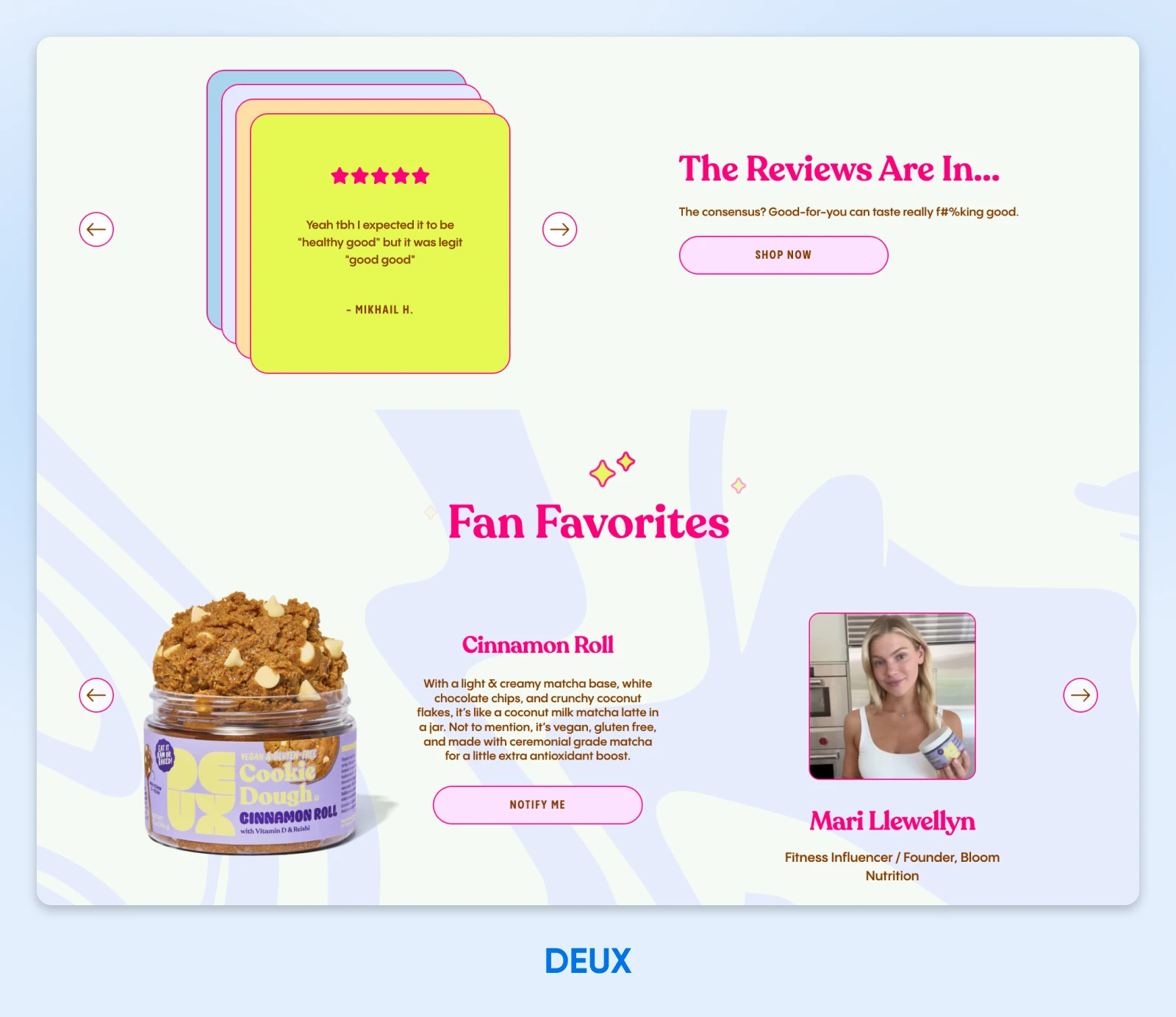
First, they focus on real consumer reviews that share how great their snacks taste, speaking directly to the common concern most consumers will have. Then, they up the ante by highlighting the fave treats of certain pros and influencers their audience would recognize.
The fact of the matter is website users who interact with ratings and reviews convert at a 108% higher rate compared to the average website conversion rate. Don’t hesitate to include this critical feature on your own e-commerce website!
Brands that BLUF
BLUF, short for “bottom line up front,” is a well-known best practice when creating articles, marketing emails, and you guessed it: e-commerce websites.
When you design with BLUF in mind, you capture the attention of fast-moving online shoppers and may even have the chance to increase conversions before they bounce away to a competitor site. BLUF can even boost your SEO strategy, as search engines may prioritize a site where key information is quick and easy to find.
What does this look like in practice? We’ve got several great examples to inspire. No bluffin’.
9. hardgraft
The hardgraft e-commerce website pulls no punches. They know what they want their visitors to see, so they direct them to that immediately upon landing on their homepage. First, a (very) short story about their brand, followed by a few new product listings and one singular call to action to view the rest.
This bold approach to a homepage is pretty unique in the e-commerce world, but it totally works for hardgraft. The minimal, thoughtful design aligns with the vibe of the website as well as the impression their handmade goods make.
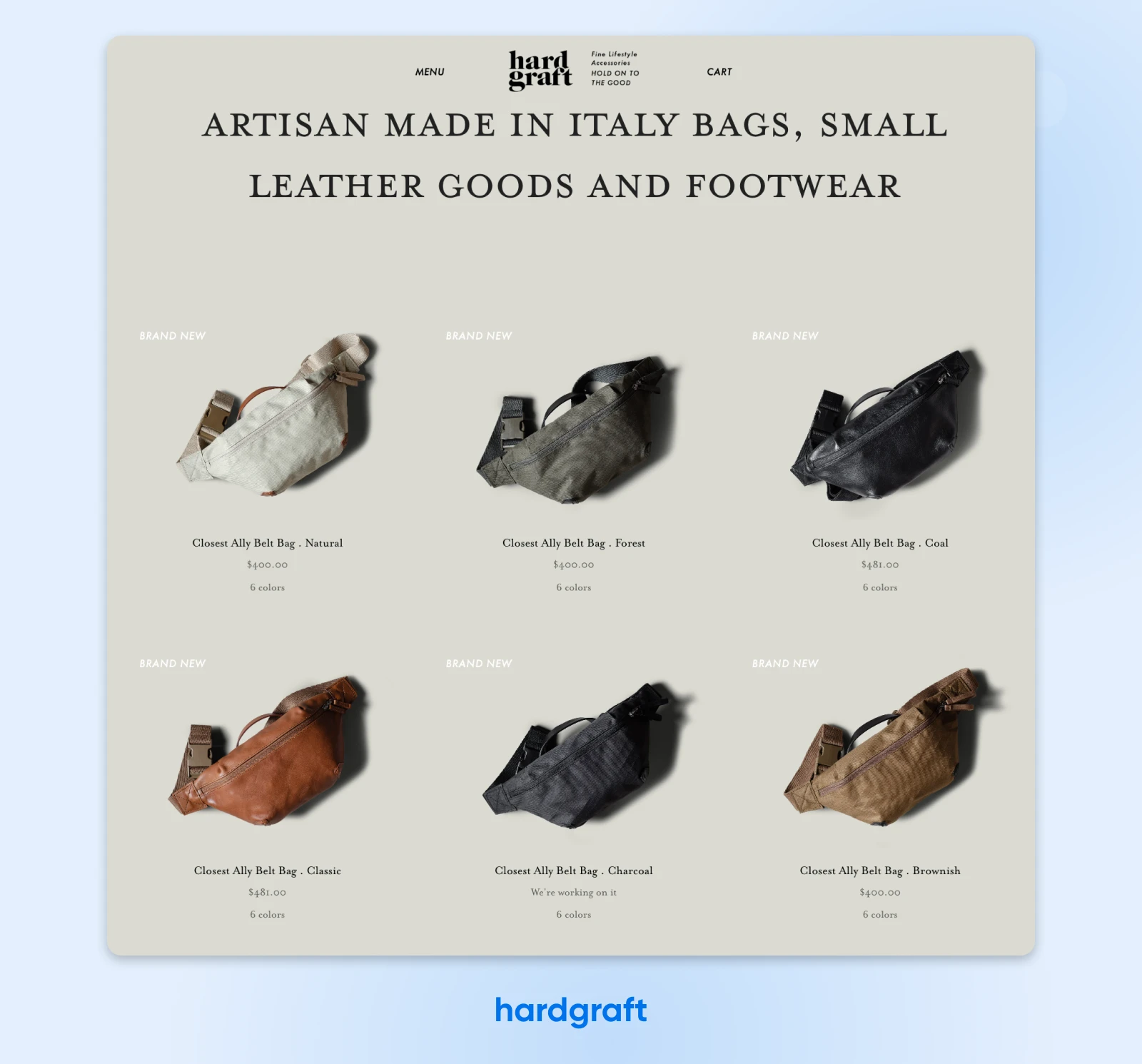
hardgraft provides a refreshing reminder that it can often pay to think outside the box when creating an e-commerce website,as long as you keep your shoppers and digital best practices in mind.
10. DVF
Another Webby Winner in 2025, the DVF website is just as daringly on-brand as the previous example.

It’s a website that manifests “show, don’t tell” the second you land on it. It’s easy to see that bold color, bold photography, and bold design choices define the DVF brand. It’s just as easy to dive right into shopping, using the call-to-action toward the top of the page, or simply clicking on some of the stunning product photos featured right on the homepage.
Take a page from this striking e-commerce site and don’t be shy about featuring your most important actions and brand characteristics up front.
Giving product pics pride of place
More than half of the 300+ product pages reviewed by Baymard’s user experience (UX) researchers were ranked as “mediocre” or worse.
Yikes.
One of the key issues? Many product listings lacked critical context, adding friction to the purchasing flow instead of making it dead simple for shoppers to hit that all important “buy” button.
The next few examples illustrate how, no matter the industry, with a little foresight it’s easy enough to build context clues into your e-commerce design and smooth out the customer journey.
11. Ruggable
Ruggable does a remarkable job providing what Baymard calls “in scale” images,something their research found a shocking 91% of product pages don’t.
First of all, their product pages star shots of different sized rugs in gorgeous, diverse rooms. And they even take it another step further with a helpful “Choose a Size” feature that shows how all their various rugs look in different room layouts.
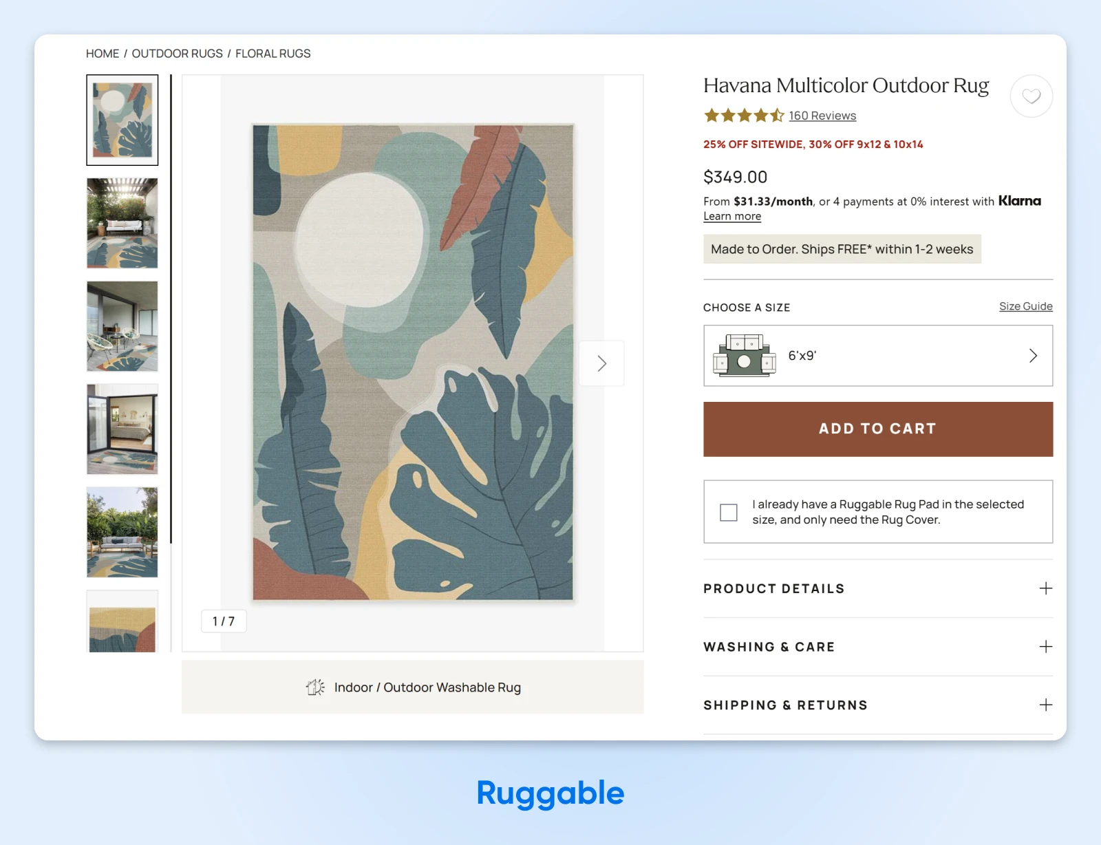
Especially for a higher-dollar product, it’s critical that an e-commerce website share lots of helpful photos that lead shoppers to imagine the item slotting into their lives perfectly.
12. Girlfriend Collective
Just 45% of the websites Baymard reviewed featured “human model” images, which provide critical context for worn products like clothing and accessories.
How big is the item? What’s the fit like? Can I layer over or under it? All of these potential purchase-stopping questions are easily answered at a glance when the e-commerce site features on-body imagery.
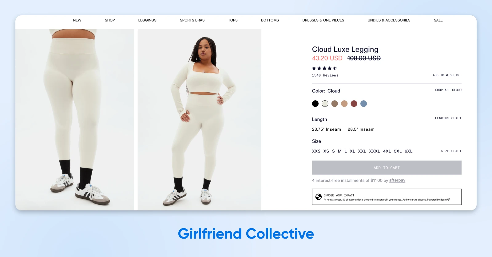
We like how Girlfriend Collective’s website handles human model images. Every single color of each product is photographed on a real body. Showing their products in motion on a variety of body types makes for a website design that feels as welcoming as the brand aims to be.
Make more sales, reduce unhappy returns, and relieve stress on your customer service team (especially if it’s just you!) with thoughtful product pics that provide critical context.
Get Your Own Copy-Worthy E-Comm Store Online Today
With the above examples that epitomize modern e-commerce website design and best practices, you have a blueprint for a successful online store.
But what if you’re still at the very beginning of your e-commerce business journey, and aren’t quite to the web design phase yet?
Don’t sweat it, our blog How To Start an Online Store & Build Your E-Commerce Empire takes you through ten tangible steps (and advice on common mistakes to avoid) to help you set up a lovely and long-lasting site.

Pro Services – Web Design
DreamHost Makes Web Design Easy
Our designers can create a gorgeous website from SCRATCH to perfectly match your brand and vision — all coded with WordPress so you can manage your content going forward.
Learn More
Did you enjoy this article?