20+ Key Design Elements for an Effective WordPress Website
When we first started working on WordPress, we had no clue how to design a website the right way. But through extensive trial and error, we’ve uncovered the key WordPress design elements that make a website truly exceptional.
Over time, we’ve built and redesigned countless WordPress websites for our businesses and personal projects. Now, many users turn to us for design guidance.
If you’re new to WordPress web design, then you probably need a lot of pointers. We get it – the internet is flooded with WordPress resources, and there’s often a lot of conflicting advice on what to do or not do when it comes to design.
Don’t worry, though. In this article, we will walk you through the essential WordPress design elements. We will cover everything from choosing the right theme and color scheme to optimizing your layout for user engagement and conversions.
First Things First: Choose the Right Tool to Design Your WordPress Site
Before we go over the best design elements for WordPress websites, let’s talk about using the right tool to edit your site.
We’ve tried many ways to build websites, from easy drag-and-drop builders to coding by hand when we need to add special features. Each method has its pros, depending on what you need.
Having said that, we find that the best WordPress website design tool is the one that:
- Fits your skills and what you want to do. If you’re new to this, then drag-and-drop page builders are great because they’re easy to use and don’t need coding. But if you know how to code, then you might like the control of doing things with code.
- Has all the features you need. Some theme builders, like SeedProd, have special blocks like testimonials and countdown timers that can help turn visitors into customers. Others just have basic parts of website design. Think about what your site needs to work well.
- Works well with other software you use. Whether it’s for email marketing or design software like Figma, everything should work together smoothly. This makes it easier to add cool design elements to your WordPress website.
- Suits your budget. You don’t want to spend too much on a tool with features you won’t use. Look for something that gives you the most for your money.
We’ve written plenty of reviews and lists for various web design tools, including AI website builders. But we keep coming back to SeedProd as our favorite.
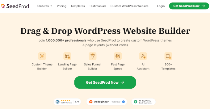

As a theme builder, SeedProd is easy to use but still has lots of features. You can drag and drop things where you want them, and it has more blocks and elements than what comes with WordPress normally.
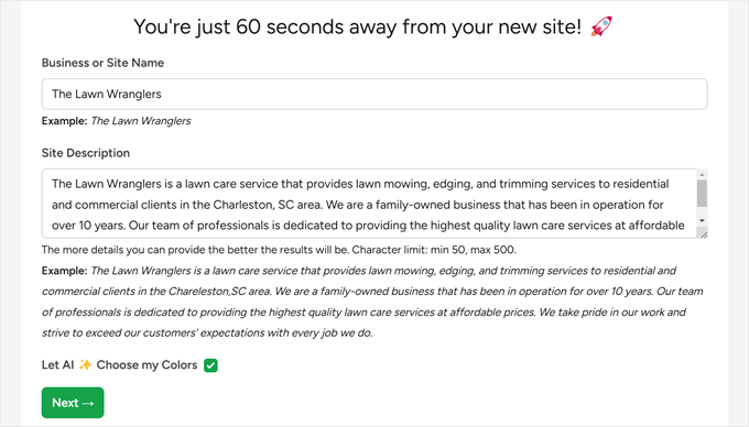
SeedProd even has a cool feature that uses AI to make a whole website for you. You just tell it what you want, and in less than a minute, you have a new site.
You can learn more about this in our full SeedProd review.

If you’re not a fan of SeedProd, then another page builder we like to use is Thrive Architect. This page builder is slightly more advanced, but it integrates with a lot of conversion rate optimization tools, including Thrive Ultimatum.
We also like a tool called CSS Hero. It’s great if you’re using a classic WordPress theme but want to change how it looks without coding or need more flexibility than what the theme developer offers.
You can read more about it in our CSS Hero review.
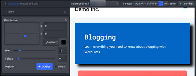

Of course, you can always stick with built-in WordPress tools like the full-site editor. This feature lets you customize your theme using blocks, just like writing a post or creating a page. But you might need some Gutenberg block plugins to get more advanced design options.
Once you have chosen the right tool, you’re ready to design a WordPress website that looks great and is easy for people to use. Here are the topics we will cover, and you can use the quick links below to navigate through this article:
Must-Have WordPress Web Design Elements
Having worked on numerous WordPress websites, we’ve learned that design needs can vary greatly.
However, there are some key elements that every site should have, regardless of its niche or purpose. These essential components form the backbone of effective WordPress website design and contribute to a great user experience.
In this section, we will explore these must-have design elements for your WordPress site. We’ll discuss various plugins and themes that can help you implement these features.
Keep in mind that not all tools may suit your specific needs. If you want to test them without risk, try using WordPress Playground. It lets you experiment with different design elements without affecting your live site.
1. Responsive WordPress Theme
The foundation of any great WordPress website design is a functional, good-looking, and mobile-friendly theme. Without it, your site may struggle to provide a consistent user experience across different devices, which is very harmful in today’s mobile-first world.
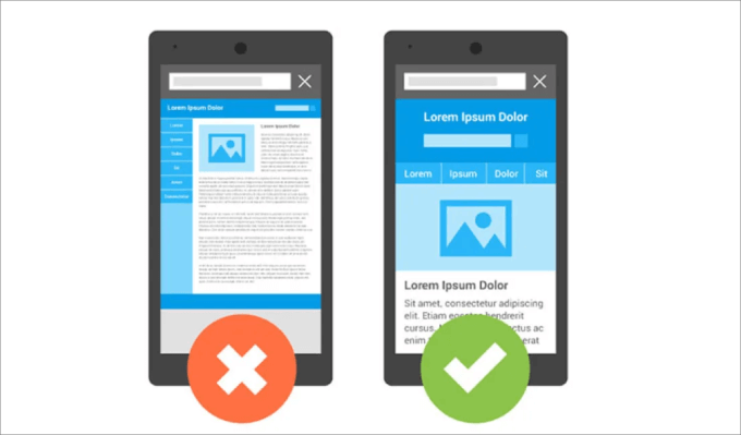

After testing out different WordPress themes for years, we’ve developed a set of criteria on how to choose the best WordPress theme for your website.
First, ensure the theme is responsive. It should look good and function well on all screen sizes. Check out our guide on how to view the mobile version of WordPress sites from desktop to test the theme.
Next, see if the theme includes all the features you need. Some themes may have layouts with sidebars, some include animated effects, and some may even come with separate plugins for additional functionality.
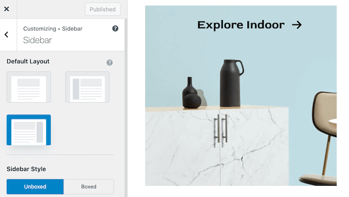

Also, choose a theme you can use long-term. Changing WordPress themes can be challenging and often requires rebuilding parts of your site. Make sure the features and design elements suit your long-term needs.
Other than that, you will want to check compatibility with popular plugins and page builders you plan to use. For example, if you’re planning to use WooCommerce for an online store, then you need to ensure the theme is compatible with it.
On a related note, make sure to test your WordPress theme against the latest standards. This step is very important to make sure your theme follows WordPress’ rules and modern web standards, which can prevent security vulnerabilities and compatibility issues.


You also need to check the performance. If possible, test the theme’s demo website for speed. Some themes may come with unnecessary bloat that slows down your site.
Additionally, ensure the theme has good documentation and support. Check when the WordPress theme was last updated, as this can be crucial when you need help.
You can also enable auto-updates to keep your theme always current with the latest features and security patches. That being said, we don’t recommend doing this if you have a complex setup, as some updates can break your site.
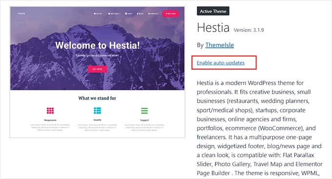

Last but not least, consider your budget. Premium WordPress themes are often high-quality, but that’s not always the case. With free themes, be careful about where you download it from. Our guide on free vs. premium WordPress themes can help you decide.
With our own website, we’re pretty picky about our theme. That’s why we decided to create a custom WordPress theme on top of the Genesis framework. This lets us have full control over our design and functionality.
If you use builders like SeedProd, they often come with their own themes. This way, you don’t need to look through multiple sources to find a compatible theme and page builder combination.
In this case, you just need to pick one whose colors and style suit your needs so that you don’t need to make so many changes.
If you need more guidance, we have a comprehensive guide on the best and most popular WordPress themes you can check out.
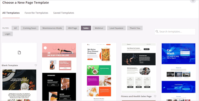
And if you use SeedProd, check out our list of the best SeedProd templates and website kits.

2. Color Scheme That Represents Your Brand
Choosing the right colors is important when selecting or customizing a WordPress theme. Ideally, you’d be able to find a theme with a color scheme that perfectly matches your brand, but this isn’t always possible.
For businesses, you probably already have an established color palette that aligns with your brand identity, such as the colors in your logo. If not, now is an excellent time to create one, especially for your website.
Choosing colors for a website is different from other design projects. Here are several things we consider when selecting a color scheme:
- Consistency – Your website’s colors should match your brand’s existing visual identity to maintain a cohesive brand experience.
- Personality – Colors can show specific emotions. That’s why you will want to choose colors that reflect your brand’s personality. For example, blue is often associated with trust, while green can represent growth.
- Industry – Consider industry conventions. For instance, financial websites often use blue to convey trust and stability, while health and wellness sites might lean towards greens and whites for a clean, natural feel.
- Readability – Ensure your text color contrasts well with the background color so that visitors can easily read your content without straining their eyes. The same goes with your link color. It should stand out from regular text but not clash with the overall design.
- Visual hierarchy – You can use color to guide users’ attention to important elements like calls-to-action or key information. For example, if the website is promoting a sale, then the ‘Buy Now’ button can be in a bold, contrasting color from the background color to draw the eye.
- Cultural context – Be mindful of how colors are perceived in different cultures to avoid unintended meanings. For instance, while white symbolizes purity in some Western cultures, it’s associated with mourning in some Eastern cultures.
For non-designers, choosing the right color scheme can be challenging. We like using tools like Adobe Color CC and Coolors, which can recommend colors to use based on the main color you’ve chosen.
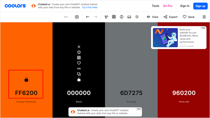

This way, you can easily create a harmonious palette that complements your brand’s primary color.
There is no hard rule on the number of colors to use in your website design, but it’s generally good practice to keep it simple. A typical color scheme might include:
- One primary color for your brand identity, often used in logos and headers
- One secondary color for accents and to create visual interest, like highlighting important sections
- One color for call-to-action buttons to make them stand out
- A neutral color (like black, white, or gray) for text and links
This approach creates a balanced and visually appealing design without overwhelming the user. The primary color establishes your brand presence, the secondary color adds depth, the call-to-action color guides user interaction, and the neutral color ensures readability.
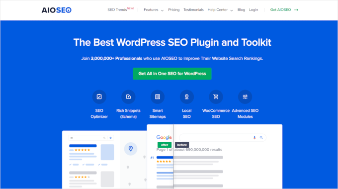
Still not sure what a good color scheme for a website looks like? There are a lot of great examples out there, but we’re going to pull one from All in One SEO’s (AIOSEO) homepage.
We like it because its color scheme only includes white, black, blue, and green, but it uses all of them effectively.
You can tell that AIOSEO’s signature color is blue, but it’s not overwhelming. It uses green for the call to action to draw attention and black and white for the text. This way, the design remains clean and professional while still being visually interesting.
Plus, there is plenty of white space in between all of the elements, so the design doesn’t feel cluttered.

Keep in mind that the method for customizing colors in WordPress varies by theme. For detailed instructions, refer to our guide on how to customize colors on your WordPress website.
3. Readable Fonts
Great content on your website will go to waste if visitors can’t read it easily. That’s why choosing readable fonts is so important. But don’t worry – readable doesn’t mean boring.
There are many fonts that are both easy to read and visually interesting. Check out our guides on the best web safe fonts and WordPress typography plugins for some great options.
A great example of effective typography is art director Dondre Green’s website. The site combines a modern sans serif font for body text with a more stylized sans serif for headings. This contrast enhances visual appeal while maintaining clarity.
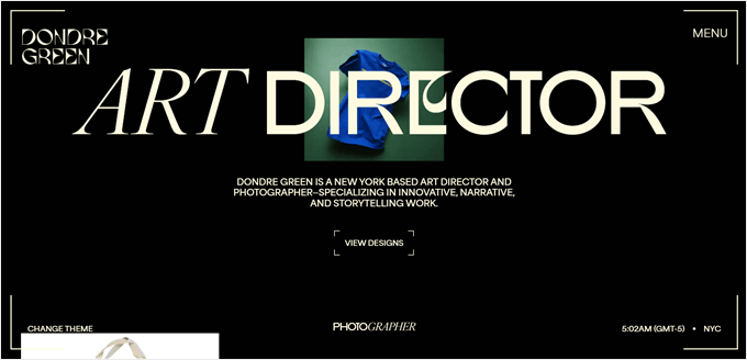

What’s particularly interesting is the creative use of styles, mixing bold and italicized fonts, sometimes even within a single word. This adds a dynamic element to the text without overwhelming the reader.
Not sure if a font is readable enough? You can try it out in Google Docs or Microsoft Word.
If you’re using Google Fonts, their type tester feature lets you preview fonts in different sizes, colors, alignments, and even languages.
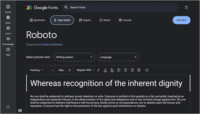

When testing fonts, you will want to look out for these key factors:
- Size – Is it easy to read on different devices?
- Line spacing – Is there enough space between lines?
- Letter spacing – Are the characters well-spaced?
- Weight variations – Is it still readable in bold or light versions?
- Screen rendering – Does it look good on digital screens, not just in print?
Once you have found your desired font, you can add it to your WordPress site. Check out our guide on how to add custom fonts in WordPress for step-by-step instructions.
If you use Google Fonts, you may want to make it privacy-friendly. Some countries have strict data protection laws that consider loading Google Fonts a potential privacy issue. That’s why many users choose to disable Google Fonts and use locally hosted alternatives instead.
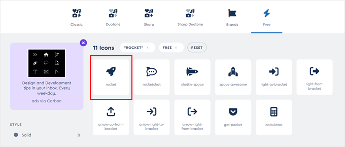
Besides regular text fonts, you can consider using icon fonts. These are special fonts that display small, scalable graphics instead of letters. You can use them for things like social media buttons or menu indicators.
Icon fonts work just like regular fonts, so they’re easy to style and don’t slow down your site.

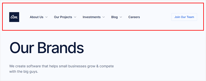
A website header is the top section of a web page, and it is usually the same across the entire site. It serves as a crucial part of website layout, providing navigation, branding, and often key actions for visitors.
A good header usually includes a logo, a main navigation menu, and sometimes a call-to-action button or search bar. However, what your header should look like will depend on your website’s purpose, content, and target audience.
For example, if you look at the Awesome Motive website, the header is simple and focused. It includes a logo, a navigation menu with dropdown options to access different pages, and a call-to-action button to join the AM team, which leads to the careers page.

On the other hand, a large website like Britannica has a more comprehensive header. It’s thicker and includes more elements: the logo, a search bar, links to different encyclopedia categories, a button to subscribe to Britannica membership, and a button to ask the site’s Chatbot.
There’s even a hamburger menu button at the top left corner to navigate to more pages. This design reflects the extensive content and various user needs of an encyclopedia website.


Also, some website owners choose to create a custom header for specific pages on their site. Doing this allows them to tailor the user experience for different types of content or goals.
For example, you might have a special header for your product pages that emphasizes key features or offers or a unique header for your blog that highlights popular categories.
The WordPress full-site editor and page builders like SeedProd offer this ability, so you can easily create and manage multiple headers.
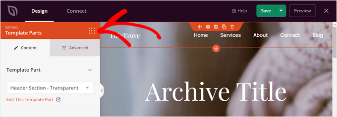

The navigation menu is a part of the header, but we feel it requires a special section on its own. A well-designed menu is very important for the user experience and can significantly impact how visitors interact with your site.
When you create a menu, you need to consider how mobile users will interact with it, too. A menu is often pretty large on desktop, but space is limited on mobile devices. This is why a mobile-ready menu is so important in modern WordPress website design.
When deciding what to include in your menu, consider these questions:
- What are the most important pages or sections of your website that users need quick access to? Think of your core pages like your homepage, product or services page, blog page, and so on.
- Is there a primary action you want visitors to take, like signing up or making a purchase?
Just like there are different types of headers, there are also different types of menus. Most websites use a standard horizontal menu that includes links to their main pages.
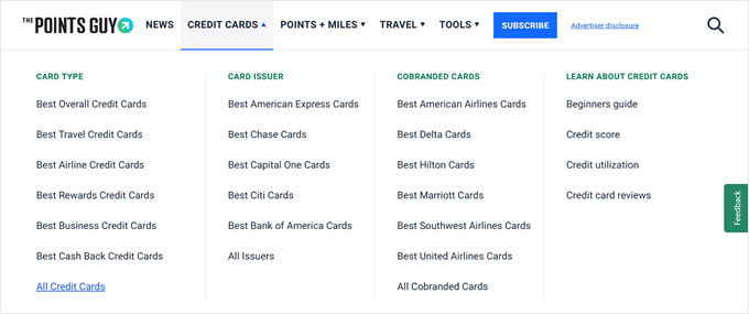
If there are multiple pages they need to cover, then most likely they will use a dropdown menu or a mega menu, like in the example below by The Points Guy.

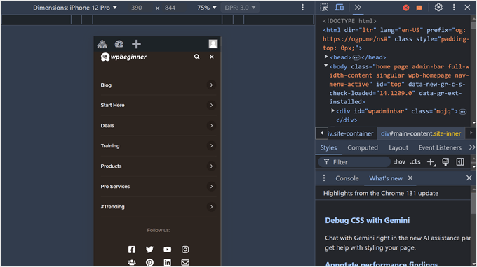
A lot of websites also choose to use a slide panel or full-screen responsive menu. The second option is actually what we use here at WPBeginner when our website is viewed on mobile.
We have a lot of blog categories, so doing this allows us to present all our options clearly without cluttering the screen.
Here’s what it looks like if you use the Inspect tool to view it:

There are many tips and tricks to style your navigation menu. For example, some people choose to make their menu sticky and floating so that it’s always visible as users scroll down the page. This can improve navigation, especially on longer pages.
Some users also apply CSS to highlight a specific menu item. This allows you to draw attention to important pages or sections, but you can still manage all the menu options as a single item when needed.
If you want more tips and tricks on how to style your menu, just check out these guides:
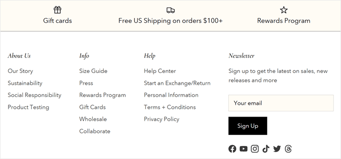
A footer is the bottom section of a website, and it appears consistently across all pages. It typically complements the header, providing extra navigation options and important information without cluttering the main page.
Despite being at the bottom, a footer is crucial for several reasons. Many businesses and online stores have realized its potential and use it creatively.
Most websites would include things like links to pages that otherwise wouldn’t fit in their main menu, copyright information, and privacy policy.
But these days, you’ll often find newsletter signup forms, customer testimonials, and, at times, a list of benefits to persuade why you should shop on the website.

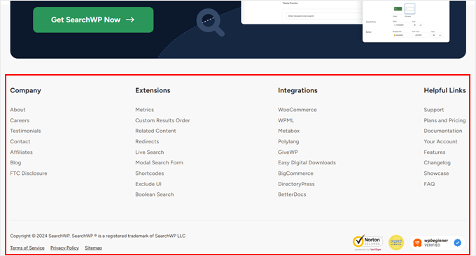
A great example of an effective footer is SearchWP‘s website. Their footer includes links to all important pages, recommended integrations, and a sitemap.
They’ve also added security and trust badges to boost social proof. Above the large list of links, there’s a call-to-action button to get SearchWP, which targets users who have scrolled all the way down and are potentially interested in the product.

For more inspiration, check out our WordPress footer design examples and our list of things to add to your footer on your WordPress website.
7. Impressive Above-the-Fold Section
In our experience, the main part of a WordPress website can vary a lot depending on the website type, so you can’t really create a one-size-fits-all design. However, regardless of the website and industry, we think it’s always good to have a strong above-the-fold section.
‘Above-the-fold’ means the content that’s visible on a web page without scrolling. It’s one of the most crucial parts of website layout, as it’s the first thing visitors see when they land on your site.
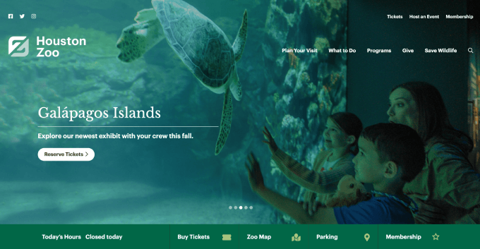

A strong above-the-fold section usually requires an impressive hero image, which is a large, eye-catching visual that dominates the top of the page. It should be relevant to your content, high-quality, and optimized for web use.
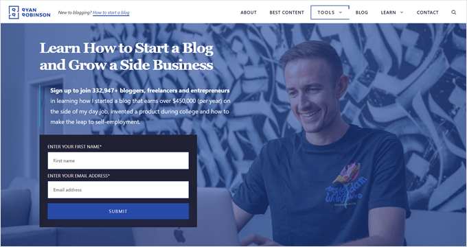
Having a hero image is common among online stores and business websites, but even blogs these days use this approach. They use it to feature their latest or most popular posts or to explain briefly what the blog is mainly about.
A great example is Ryan Robinson’s website. His above-the-fold section shows a large image of him, a strong headline, a subheadline encouraging sign-ups with social proof (‘join 332,947+ bloggers’), and a newsletter sign-up form.

We typically like to use simple tools like Canva to create hero images. But feel free to check out our list of Canva alternatives if you’re looking for different options.
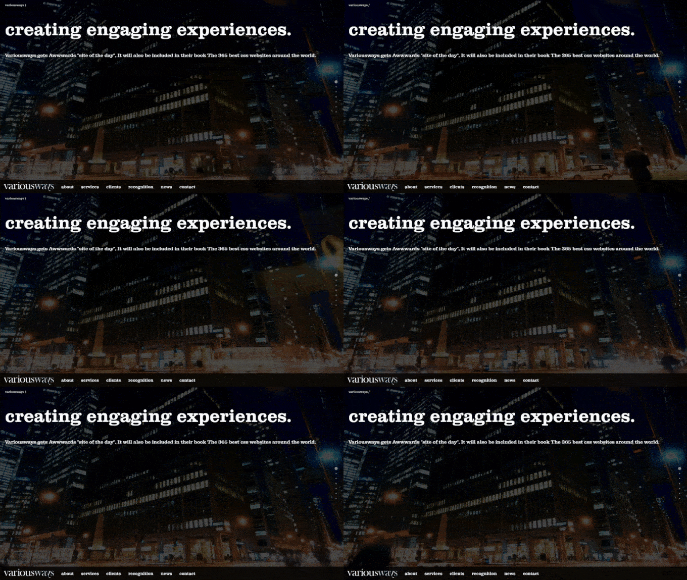
Alternatively, some users choose to add a full-screen video background. This can make your site more lively and grab visitors’ attention right away.
However, we only recommend doing this if you upload your file to a hosting platform like YouTube or Vimeo, as hosting your own videos can slow down your WordPress site.
For more inspiration, take a look at our curated list of excellent WordPress website examples.
8. Easy-to-Use Contact Form Page
Another must-have WordPress design element is a contact form page. Whether you’re running a blog, an online store, or a business website, you always need a contact form to let users easily message you directly on your website.
A good contact form is simple, easy to use, and collects only the necessary information. It should not overwhelm visitors with too many fields or complex questions, as this can intimidate users.
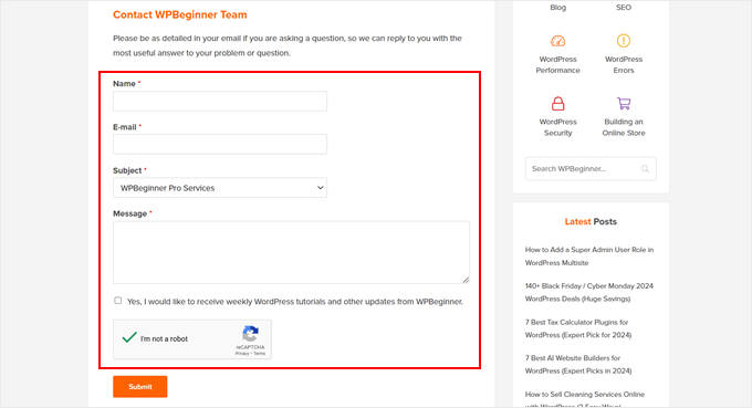

When you have a small website, a single contact form should be enough. Typically, you need fields for the first name, email address to send and notify a reply, and the inquiry.
But once your website has grown and you can identify commonly asked questions, you may want to customize your form further.
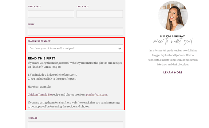
For example, on the Pinch of Yum website, they’ve added a ‘Reason for Contact’ dropdown field. When you select an option, a short message related to the reason appears above the message field, which you need to read first.
This approach can help filter inquiries and provide immediate answers to common questions, improving efficiency and user experience.

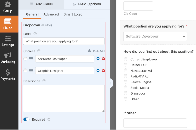
Thankfully, form builder plugins like WPForms can easily grow with your website needs. It’s one of the many reasons why we keep coming back to WPForms for years.
Besides dropdown fields, you can enable conditional logic in your form so that the fields can appear or hide based on the user’s answers. This can be useful when you need to collect different information for different types of inquiries.

If you run a multi-author blog, then you might want to create custom author profile pages and add a contact form to each one. This allows readers to reach out directly to specific authors, enhancing engagement and networking opportunities.
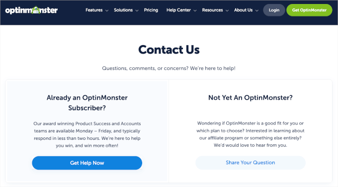
For businesses, the contact page may serve two purposes: a place for potential clients to reach out and for existing customers to ask for support. In this case, you might want to create two different buttons leading to separate forms.

You may even want to add a click-to-call button if you offer phone support, making it easier for users to get in touch in their preferred way.
9. Web Accessibility Features
Last but not least in our list of the essential WordPress design elements, your WordPress website design needs to be accessible to all users.
Many users have disabilities, making it hard for them to navigate and interact with websites. If your site doesn’t cater to these needs, then a significant number of users may not be able to access your content. This means you could be losing valuable visitors and potential customers.
Plus, accessibility isn’t just about inclusivity – it’s also a legal concern.
The Americans with Disabilities Act (ADA) allows consumers to file complaints against websites that don’t meet accessibility guidelines. Failing to fix those problems could damage your reputation and potentially lead to financial losses.
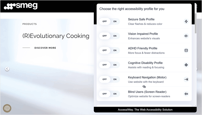
A great example of an accessible website belongs to Smeg. This site has a handy accessibility toolbar that lets you adjust the website’s features based on different needs.
Besides adjusting the page content, such as font sizes and alignments, you can choose specific profiles, like seizure-safe, ADHD-friendly, blind users, and more. This gives users a quick way to make the website more accessible without having to change many different settings.

While WordPress already has built-in functionalities to make your website accessible, there’s a lot more you can do. You can check out the W3C website for starters, which offers comprehensive information on web accessibility standards.
Additionally, our guide on how to improve the accessibility of your WordPress website provides practical steps you can take.
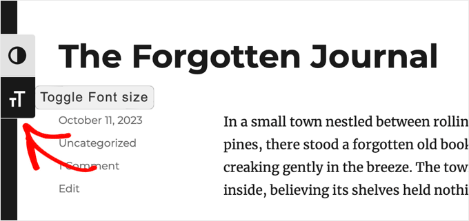
One easy way to enhance accessibility is by installing the WP Accessibility plugin. This plugin adds a toolbar to your website where users can resize fonts, which is great for those with visual impairments.
It also allows users to view your site in high-contrast color mode, similar to dark mode but more friendly for colorblind users.

Another important feature is enabling arrow-key navigation on your website. This is important for users with disabilities who rely on keyboard navigation rather than a mouse. It’s a simple change that can significantly improve the user experience for many visitors.
Top Web Design Elements for WordPress Blogs
While many design elements are universal across different types of websites, WordPress blogs often have unique features that set them apart. Let’s look at some key design elements specifically for WordPress blogs.
One of the things that make blogs so unique is the layout associated with them. You may be familiar with the design where the main content occupies the left or right side, and a sidebar appears throughout all the posts and pages.
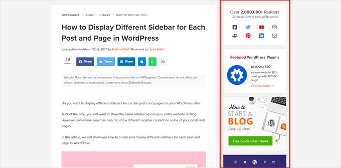

We like using a sidebar because it helps us feature content that may be helpful to readers, like a featured must-have WordPress plugin, free resources, and even deals and coupons.
However, this is optional. These days, not all blogs have a sidebar. You’ll find some without a sidebar or just with a floating element, like social icons or a table of contents for the blog post.
This clean, minimalist approach aligns with current web design trends that prioritize simplicity and focus.
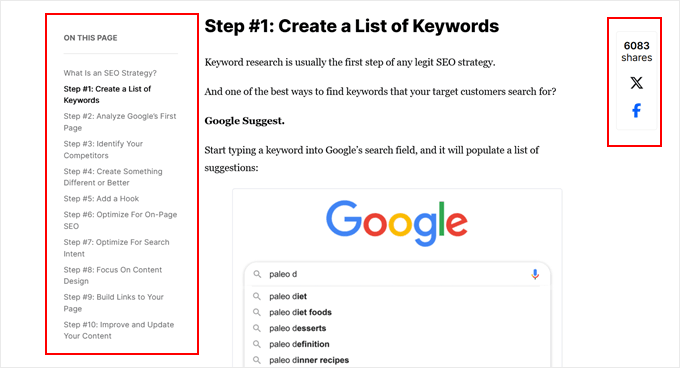

But if you do decide to feature a sidebar, we have some sidebar tips and tricks to make the most out of this element:
11. Content Recommendation Blocks
Another key element in WordPress blog design is content recommendation blocks. Now, how and where bloggers display them varies by layout and preference.
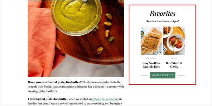
If the single post template has a sidebar, then many users will display recent posts or their most popular posts there, just like on the Cookie + Kate website.

Another option is to display it at the bottom of the post, which is what we do at WPBeginner.
This way, readers who have finished the article can easily find more relevant content to explore, increasing pageviews and reducing bounce rates.
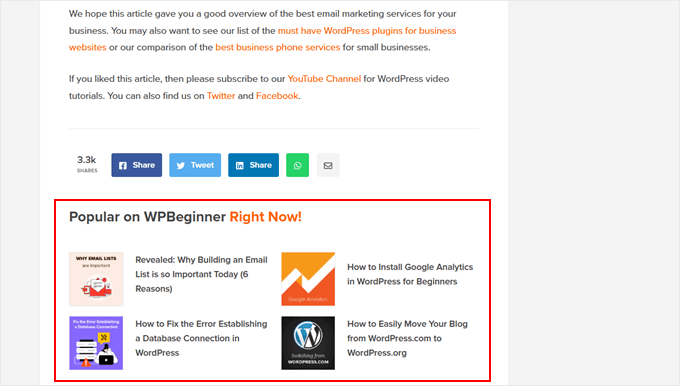

With recommending content, the most important thing is to consider the right placement. It should be visible enough to catch the reader’s attention but not so prominent that it distracts from the main content.
Also, for related content, you may want to think about how relevant it is to the current post. You may even want to display the posts with thumbnails so that readers can quickly get a visual sense of what the recommended content is about.
Additionally, we’ve found a cool trick to highlight new posts for returning visitors in WordPress. This way, regular readers can easily spot fresh content, encouraging them to stay longer on your site and explore more.
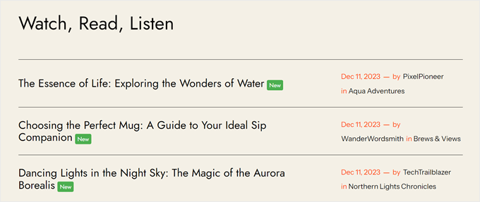

Not sure what your most popular posts are? Then, we recommend using an analytics plugin like MonsterInsights, which can pull this data directly from your Google Analytics account.
This saves you the time and effort of manually tracking and updating your popular posts. You can display these popular posts as a block on your web page, and it will automatically change depending on what’s most popular among your readers.
12. Readability Aids
Did you know that the average human attention span is now shorter than that of a goldfish? That’s why it’s more important than ever to add elements to your blog posts to grab and maintain users’ attention.
You should consider using features in your blog posts that boost readability, allowing readers to easily scan and absorb your content.
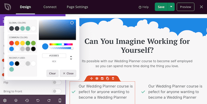
For example, you can add a custom shape divider if your blog post is particularly long. This creative design element can visually break up lengthy content, making it less intimidating for readers.
SeedProd has this exact feature in its page builder, and you can customize the shape’s design, colors, size, and more.

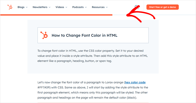
A lot of blogs, like HubSpot, add a reading progress bar to show users how far they’ve scrolled through an article.
This simple yet effective element improves user experience by giving readers a visual cue of their progress, encouraging them to complete the post.

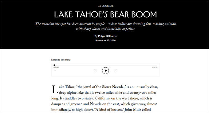
You might also consider adding drop caps to your content, maybe not at the start of every paragraph, but instead for new sections or chapters. This can create visual interest and guide the reader’s eye.
Here’s an example from The New Yorker:

If you have lots of information to share but want to keep your main content concise, consider adding simple yet elegant footnotes. This allows you to provide additional details without cluttering your main text.
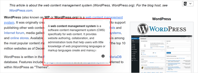
Another useful trick is showing live previews of your internal links. This feature can give readers a glimpse of linked content without leaving the current page. It’s an innovative approach to internal linking that can keep users’ attention as they read your content.

13. Relevant Featured Image
While blog posts are mainly text-based, images play a crucial role, especially the featured image.
Imagine running a food blog, and you post about a new recipe, but there’s no featured image to showcase the dish. How would readers be enticed to click and explore the post?
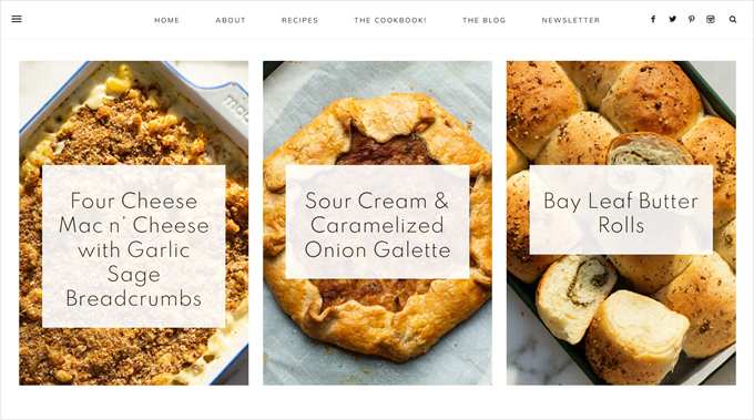

A good featured image should be:
- Relevant to the post content
- High-quality and visually appealing
- Properly sized for your WordPress theme (check your theme’s documentation for more information)
- Optimized for the web to ensure fast loading
- Consistent with your overall brand aesthetic
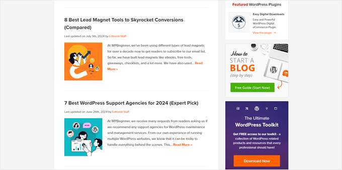
For WPBeginner’s featured images, our goal is to create a simple visual that shows what the post is about. However, it should still look interesting enough to make readers check out the post.
We try not to make it too artistic, as users may not immediately get what the image is trying to communicate.

You can create custom featured images using online tools like Adobe Express or Canva or use royalty-free images to save time. Just make sure you have the right to use any images and that they align with your blog’s style.
We understand it’s not always possible to create a unique featured image for every post, given the time and potential cost involved. In such cases, it’s good to set a fallback featured image. This ensures that even posts without a custom image have a visual representation.
For variety, check out our guide on setting fallback featured images based on post categories. This approach adds visual diversity to your blog and helps users easily see posts with different topics.
14. Clear Visual Elements
Not everyone likes to read long chunks of text on their screens. That’s why we recommend adding visuals to your blog posts whenever necessary so that users can better understand your content.
However, sometimes plain images or photographs aren’t enough. You may need more interactive or informative visual elements to truly engage your readers and communicate your ideas.
Plus, visual elements can make your text content more expressive and relatable. For instance, emojis can add personality and emotion to your writing, helping to communicate tone and create a more engaging reading experience.
One tip you can incorporate into your WordPress website design is to add interactive image hotspots. This feature is particularly useful for product reviews or tutorials, allowing readers to explore different parts of an image for more detailed information.
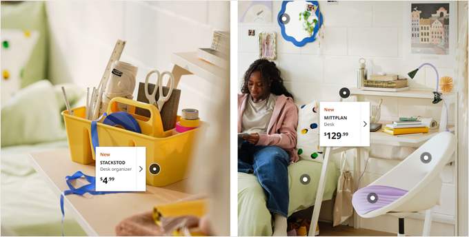

If you display lengthy quotes or long code blocks, then you may want to insert a custom scrollbar into those elements. This allows readers to easily scroll through without losing their place in the main content.
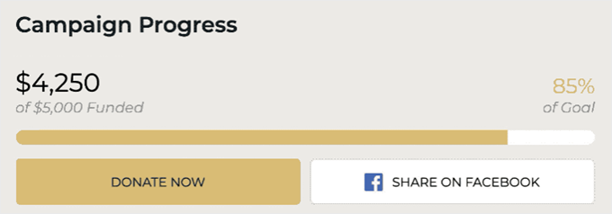
Another interesting visual element is a progress bar. You can use it to show a project completion status, learning milestone, skill level, nutritional information, and more.

WordPress Design Elements to Convert Visitors Into Customers
Next, let’s see some key WordPress design features that can turn your website into a powerful tool for attracting and keeping customers.
15. Waitlist Coming Soon Landing Page
Whether you’re starting a service-based business or an online store, one element we’d recommend you make is a waitlist coming soon landing page. This is an important part of website design that can build anticipation and capture leads before your full site launch.
It’s different from an ordinary coming soon page because the goal is to not just inform visitors about your upcoming launch. It’s also to actively engage them and encourage them to join a waitlist. This approach can help you see interest and build an initial customer base.
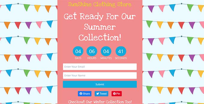

We have a guide on how to create a waitlist landing page for more info. The tutorial uses SeedProd, so it’s easy to use even if you’re not a design expert.
That being said, here are some key elements you can add to your waitlist landing page:
- A countdown timer widget to create a sense of urgency and excitement about your launch. SeedProd offers this element by default, so you don’t need to install a separate plugin to enable it.
- An email subscription form to capture visitor information. We recommend using an eye-catching color for the call-to-action button.
- An exit-intent popup to capture visitors who are about to leave your page. You can use OptinMonster for this, which is what we used to increase our email subscribers by 600%.
- Some visuals, like images, give users a preview of what you’re selling. This could be a partially obscured product image, a behind-the-scenes snapshot of your service in action, or even a stylized graphic representation of what you’ll offer.
- Social media buttons to get users to follow you on your official social profiles. This way, they can get the latest updates about your product or service launch.
- Social sharing links so that users can help spread the word about your business.
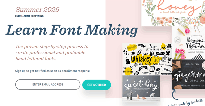
Here’s a great example of a waitlist landing page by Every Tuesday. This waitlist is trying to build hype for an upcoming enrollment for a fontmaking course.
We like how it shows examples of previous work by former students. This works as social proof and shows what future students can achieve.

16. Eye-Catching Call-to-Action Button
We’ve mentioned call-to-action (CTA) buttons a few times throughout this guide, and for good reason. They’re one of the most important parts of WordPress website design because they directly influence user behavior and drive conversions.
But if you think any shape of a button will do, think again. We’ve talked about how color matters earlier, but there’s a lot of science that goes into what makes a CTA effective. It’s a key element that can make or break your conversion rates.
First, it’s best to include only one primary CTA per page to avoid confusion and decision paralysis. Otherwise, you risk overwhelming your visitors.
That doesn’t mean you can only feature the button once; it only means you should focus on one main action you want users to take.
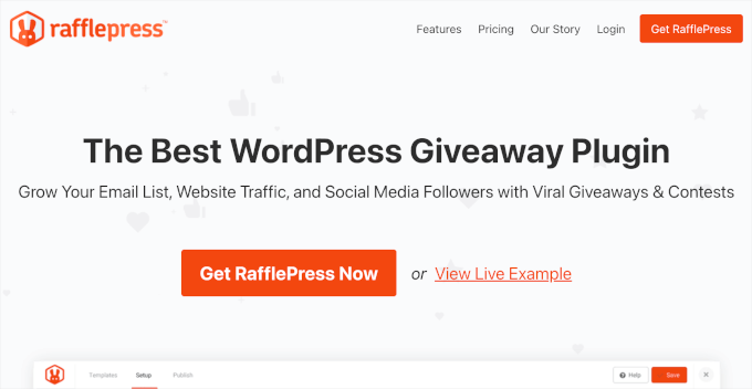
Let’s use RafflePress’ homepage as an example. Above the fold, the CTA button ‘Get RafflePress’ is repeated twice in the menu and the hero section.
It also includes a link to ‘View Live Example,’ but it’s not designed like the ‘Get RafflePress’ button, so it doesn’t compete for attention.

Secondly, while generic CTA copy like ‘Learn More’ or ‘Sign Up’ are okay, you can take it to the next level by making it more benefit-driven.
When crafting your call to action, you will want to make sure you briefly highlight the benefits you are offering and explain what the users will gain by taking action. If they can see what’s in it for them, then they will be more motivated to click.
John Turner, co-founder of SeedProd
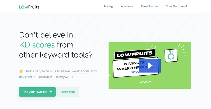
A great example is LowFruits, which is a keyword research tool.
Their CTA is ‘Find your lowfruits,’ which is both clever and describes the benefits users will get: keywords like long-hanging fruits that are easy to rank for.

John Turner talks more about these call-to-action best practices that can increase your conversions in his guest post for WPBeginner.
Finally, make sure your CTA button is clickable on desktop, mobile, and tablet devices. A button that works perfectly on a desktop but is difficult to tap on mobile can significantly hurt your conversion rates. This is especially true given the increasing number of mobile users.
17. Easy-to-Read Feature Boxes
If you sell a single product, a SaaS platform, or have a service-based business, then displaying feature boxes is a good idea. This section typically lists your product or service’s key features, but when it’s just full of text, it can become difficult to read and digest.
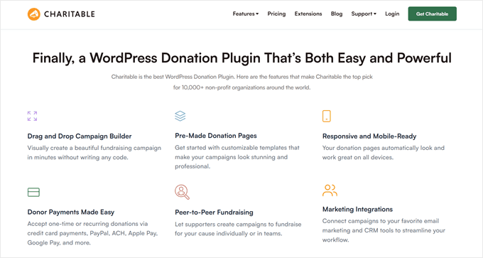
That’s why many business websites now include feature boxes with icons. These visual cues help users quickly identify and understand each feature, improving the overall user experience.
Icons also add a visual break from text, making the layout more engaging and less overwhelming.
Other than that, we also try to add a small heading that describes the feature briefly and clearly. This is followed by just a single sentence that describes it. We don’t want to make it too long to avoid cluttering the page.
The homepage at Charitable demonstrates this really well:

18. Social Proof Elements
When we were doing research for our eCommerce statistics piece, we found out that 95% of shoppers look for reviews and other forms of social proof before making a purchase.
This makes sense. If potential customers see positive reviews on your website, then they will feel more confident in their decision to purchase from you.
If you use a landing page plugin like SeedProd, then you will get access to blocks designed specifically for showcasing social proof.
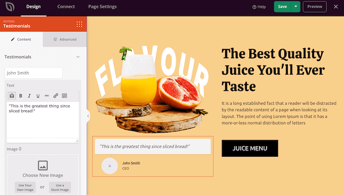

For instance, you can add rotating testimonials. This is a slider that shows multiple testimonials from a single place at once, and users just need to use the arrow buttons to read them.
You can also display number count animations. These are good for telling users how many customers you’ve served, products you’ve sold, or any other impressive statistics about your business.
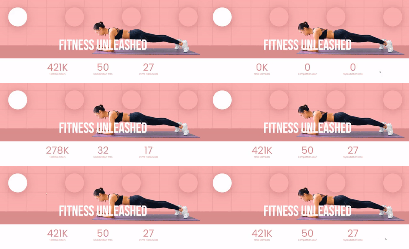
Don’t just place these reviews on your homepage. You can also display them on other parts of your site, like including them in the preloader animation, for example.
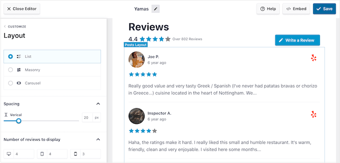
Want to display testimonials without using a page builder? Try using the Reviews Feed plugin by Smash Balloon. This plugin makes it even easier as it can pull review content from third-party sites like Google, Yelp, Facebook, and more.
This way, you can automatically showcase fresh, authentic reviews from various platforms directly on your WordPress site.

19. Attention-Grabbing Banners
You might have created a Google Ad landing page for your product or service. But if people aren’t converting and you’re losing money, then it may be time to consider other strategies.
Sometimes, visitors just need a gentle nudge to make a purchase. This is where website banners can be useful in your WordPress website design.
We’re talking about dynamic elements like sticky footer bars that display special offers or scrolling tickers that announce limited-time deals.
They can highlight important information, promote your campaigns, and drive conversions without being overly intrusive.
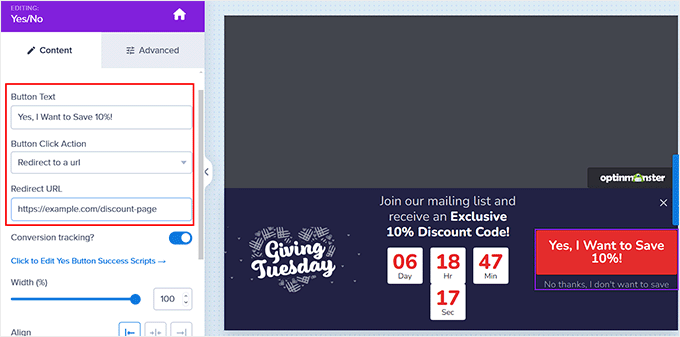

Our go-to platform for this is OptinMonster. While many know it as a popup plugin, we’ve successfully used it to display various promotions across our website.
For instance, during Black Friday, we added a floating banner on our website to direct users to our collection of 100+ exclusive deals. We made it sticky so it follows users as they scroll but kept it small enough to not hurt the user experience.
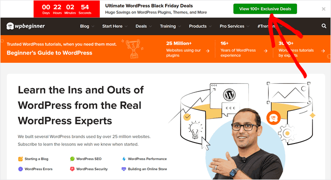

This approach to banner design is all about balance. The goal is to capture attention without overwhelming visitors, creating a user interface that guides rather than pushes.
When designing these website banners, you will need to consider how they fit into your overall WordPress website design.
They should look like they are a part of your website layout, but they should stand out enough to catch the user’s attention. We recommend using colors that complement your site’s palette while providing enough contrast.
20. High-Converting Cart and Checkout Pages
The cart-to-checkout journey is the most important part of the eCommerce user experience. In fact, in our shopping cart abandonment statistics piece, we found out that 7 out of 10 people abandon their carts before completing a purchase. That’s a huge loss of potential revenue.
If you’re seeing a high cart abandonment rate, then you should take a look at your cart and checkout pages. There may be design elements that make people doubt their purchase or leave them frustrated.
For example, design-wise, maybe you have too many fields asking for information, or the total price on the cart page and the checkout are widely different. These issues can hurt the user experience and conversion rates.
WPCode‘s checkout page is a great example. Since this is a digital product, they only ask for the most relevant information, like your email, first name and last name, and phone number.
The payment section is also on the same page, reducing the number of steps a customer needs to take to complete their purchase. The discount is automatically applied, so you don’t have to hunt for and enter a coupon code manually.
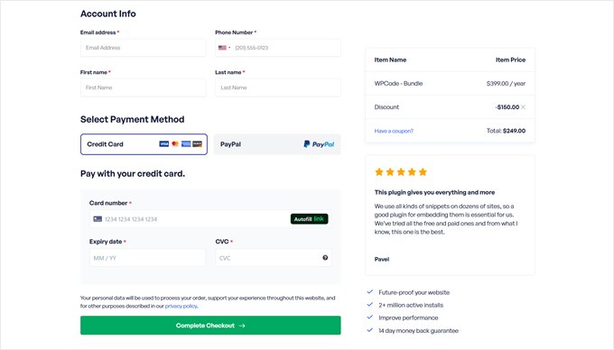

Other than that, there are social proof elements like a testimonial block to help reassure customers who might be hesitating to convert.
We have guides on how to create a custom WooCommerce cart page and how to customize WooCommerce checkout for more information.
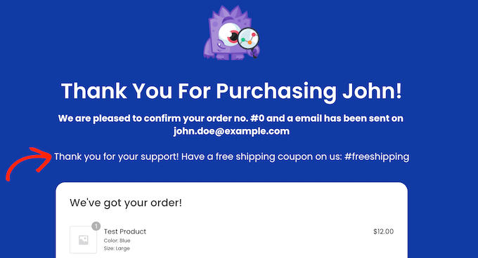
You also want to pay attention to the post-conversion thank-you page, as that’s a good opportunity to increase the average order value. You can suggest products related to the purchase or display an exclusive coupon code for the next purchase.
The best tool for optimizing these pages is FunnelKit, which is a sales funnel builder for WooCommerce that comes with ready-made thank-you page templates. You can read more about its features and capabilities in our FunnelKit review.

Nice-to-Have WordPress Design Elements to Impress Your Visitors
While the WordPress design elements we’ve talked about so far are essential for a well-functioning WordPress website, there are additional design features that can take your site to the next level.
These elements aren’t necessarily must-haves, but they can create a lasting impression on your visitors and set your site apart from the competition:
Need Help With Web Design? WPBeginner Pro Services to the Rescue
Managing all the WordPress design elements needed for an effective website can be really scary. If you’d rather focus on growing your business, then why not let the experts handle your web design?
WPBeginner Pro Services offers hassle-free WordPress website design solutions.
We provide a dedicated project manager who will work with you to create a custom design tailored to your specific needs. We will also set up all the necessary SEO and speed optimization features to ensure your site performs at its best.
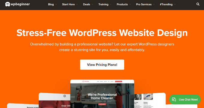

Already have a site but feel it needs a refresh? Our team also specializes in WordPress website redesign, breathing new life into your existing site without starting from scratch.
Want to learn more? Schedule a call with our experts today. They will help you come up with the best plan for your website goals and budget to make sure you get a professional, high-performing WordPress site without the stress of DIY design.
We hope this article helped you discover the key design elements for an effective WordPress website. You may also want to check out our expert picks of the best tools for creating and selling digital products and our guide on things you must do before starting a WordPress web design business.
If you liked this article, then please subscribe to our YouTube Channel for WordPress video tutorials. You can also find us on Twitter and Facebook.


 John Turner, co-founder of SeedProd