7 Website Accessibility Examples Small Businesses Can Copy
Ever walked into a brick-and-mortar store, only to discover the front door is six inches wide and the light switch lives on the ceiling?
OK, probably not. But you get the idea. That would be impossible to navigate, which is how your website feels to customers who rely on screen readers, keyboard navigation, or high-contrast modes when basic accessibility is missing.
According to the World Health Organization, around 1.3 billion people in the world experience a significant disability. That means you could be shutting out one in six potential customers if you don’t make your site a welcoming place for everyone to browse.
Web accessibility isn’t a pricey “nice-to-have,” it’s just good UX —and by investing a little time in it, you get back good SEO (and good karma). Most of the fixes you need are tweak-sized, not redesign-sized.
User Experience (UX)
User Experience (UX) refers to how online visitors interact with a website. Users often evaluate their virtual experience based on a site’s usability and design, as well as their general impression of its content.
Read More
Below, we have checklists, examples, and free tools you can use to make sure you’re nailing web accessibility. We all have a responsibility to keep the web a free and open place for everyone, so let’s dive in.
Why Accessibility Is Good Business (Not Just Good Manners)
Rates of disability are increasing as life spans increase, causing chronic health conditions to rise. People with disabilities deserve to be able to access the same information as those without, which is why it’s so important for all of us to work together to make digital content accessible and work to remove barriers to accessibility online.
As a website owner, it’s important to make sure you’re not excluding people with disabilities — even inadvertently. The ADA is a civil rights law that prohibits businesses and organizations from discriminating based on disability, so if your website isn’t accessible to everyone, it could land you in legal hot water!
But legal compliance isn’t the only reason accessibility should be a top priority when you design your site. Here are some others:
- Bigger audience, lower bounce: Accessible pages load faster for assistive tech and mobile visitors alike, which Google notices — and that means your site gets a boost in the algorithm.
- Accessibility = SEO: It’s not just about fast loading. Text alternatives, semantic headings, and logical focus order all feed search-engine crawlers clean, keyword-rich markup. In short, every dollar you spend on accessibility doubles as a conversion rate upgrade.
- Better brand love: Studies show that more and more, shoppers want to spend with brands whose values align with their own. Making your website accessible sends a message that your company has inclusive values. And companies that are more diverse and inclusive are up to 35% more likely to have financial returns above their industry average.
And while accessible website design allows people with disabilities to easily navigate your site, it includes design principles that can actually improve the user experience for all your site’s visitors. There’s literally no downside here.
10 Ingredients of an Accessible Website
There are many accessible elements you can put into practice on your site, most of which come from the Web Content Accessibility Guidelines (WCAG), an internationally recognized standard for web accessibility.
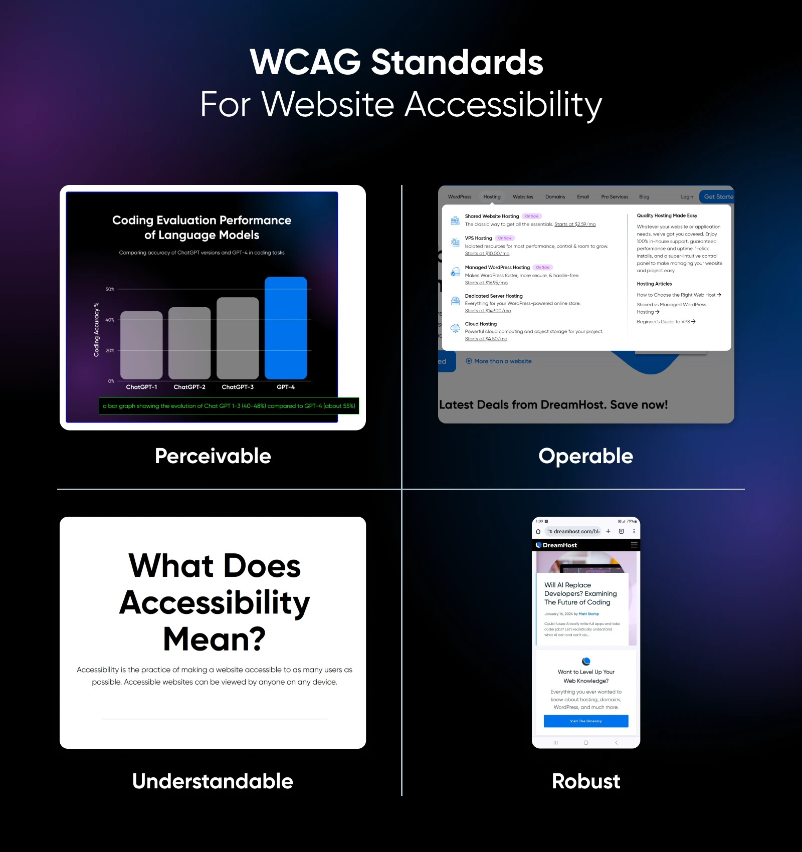
If you’re starting from scratch, these 10 are a great starting point. Use this checklist to make sure you don’t miss any:
- High-contrast color combinations between text and backgrounds: Free tools like WAVE can help you check that your contrast is high enough.
- Skip to content” links: Add an href=”#main” anchor that appears on keyboard focus, so users navigating your site by keyboard can quickly skip past navigation menus and get to the content they came for.
- Descriptive alt text: This should convey the purpose of your visuals, not file names, so those who can’t see images and videos can tell what they are.
- Logical heading outlines: Screen-reader users jump by heading levels, so putting them in the correct hierarchy order (i.e., H1, H2, H3, and so on) is important.
- Keyboard-friendly nav and forms: You can use your own keyboard to test interactive elements on your site and ensure they’re accessible.
- Web-safe fonts: These will always be readable by screen readers, display correctly on various device types, and scale up and down correctly for different users’ needs.
- Captioned or transcripted media: Not only does this make your media accessible for site visitors who are deaf or hard-of-hearing, it also boosts your SEO.
- Responsive, pinch-zoom-friendly layout: That means using a minimum of 320 px width and no “zoom=1” viewport locks.
- Sticky navigation menus with logically arranged content: This makes it so users can quickly find what they need without having to scroll for miles when they want to move to a new page.
- Clear link purposes: Write anchor text like “Download menu (PDF)” instead of “Click here” so folks using screen readers know what they’re clicking on.
7 Real-World Small-Business Sites That Nail Accessibility
Ready to see some sites in action? These examples of web accessibility all have features that you can implement on your site. To see them in action, just visit these sites and start exploring with just your keyboard’s “tab” key.
1. Blue Bottle Coffee
One of the first things keyboard users encounter here is a “Skip to content” link that jumps straight past the mega menu to the main heading. On index pages, the link even precedes a “Skip to cookie notice” option, showing respect for privacy prompts as well as navigation.
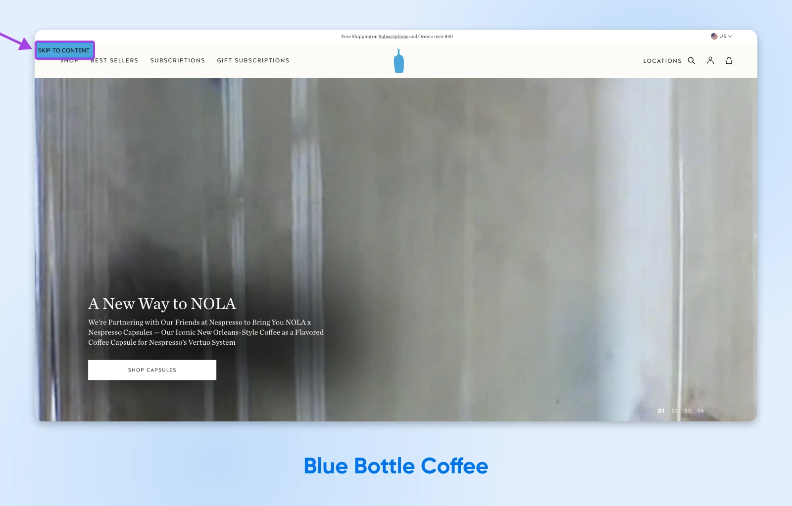
Because the skip link is coded with href=”#main” and revealed only on focus, it keeps the visual design tidy while giving screen-reader and switch-device users a friction-free start.
Blue Bottle consistently uses H2 subheadings in its brew guides, as well as alt-rich product photography. The result is a specialty coffee brand that serves usability as carefully as it serves pour-overs.
2. Fort Myers Brewing Co.
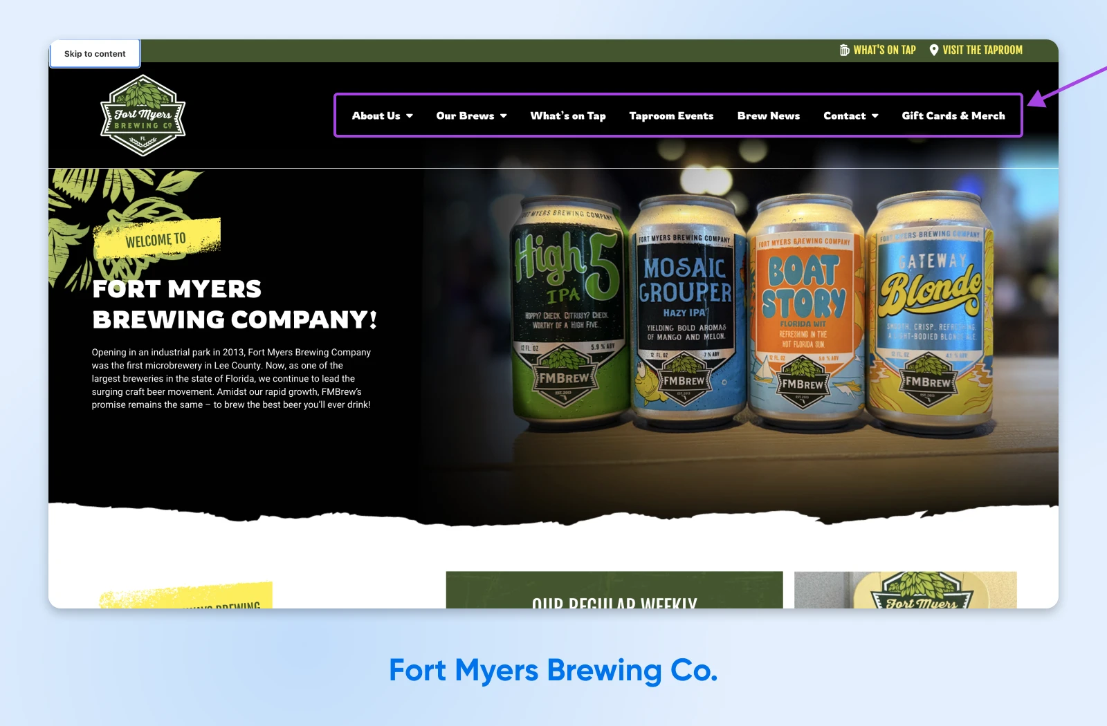
Tab onto Fort Myers Brewing Co.’s homepage, and a bold, high-contrast skip link appears before the nav. Keep tabbing and you’ll notice that every dropdown opens with Enter/Space, not just hover —critical for users who can’t operate a mouse.
Fonts sit comfortably above 18 px, and buttons carry WCAG-AA color contrast, so customers can order a flight without squinting.
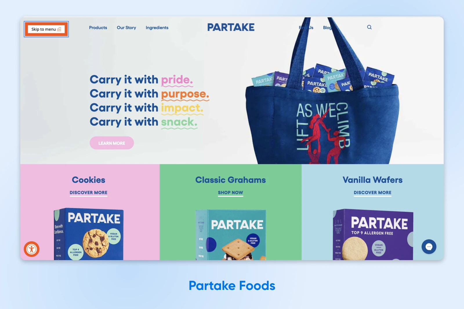
3. Partake Foods
Partake’s entire brand revolves around inclusive, allergen-free treats, so it makes sense that their site follows suit. A skip link sits atop every page, and every hero image is paired with alt text that describes flavor and packaging.
Error messaging in checkout is in plain language (“Please enter a ZIP code”) and announced to screen-readers via aria-live, so shoppers with dyslexia or low vision don’t miss a beat.
The company’s branding is all pastels, but their muted-on-hover color palette still passes 4.5:1 contrast by default, proving you don’t have to choose between pastel aesthetics and compliance.
4. Little Seed Farm
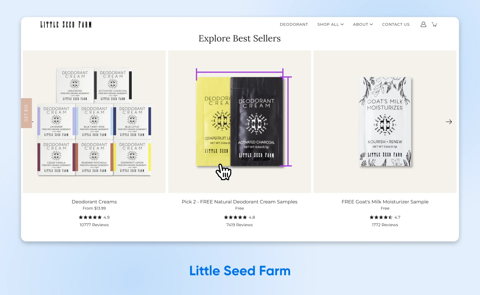
This Tennessee goat-milk-skincare brand keeps things accessible even on slower rural connections: the homepage loads a lightweight hero followed by a skip link and logical landmark roles (<main>, <nav>).
Product cards use big, tactile click-targets (44 × 44 px+), and alt text not only identifies the product but adds sensory context (“Unscented deodorant bar next to lavender sprigs”), which is helpful for shoppers choosing fragrances who can’t see the images.
5. United By Blue
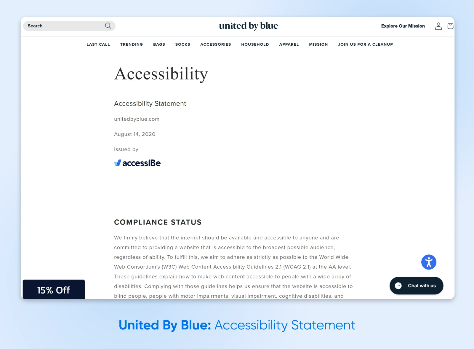
Activate a keyboard and United By Blue instantly offers two shortcuts: “Skip to content” and “Skip to Accessibility Statement.” The Accessibility Statement lists every assistive-tech feature they offer: contrast toggle, alt-text policy, ARIA landmarks,and even publicizes keyboard shortcuts (press M for menus, H for headings). That transparency educates visitors and boosts trust.
Visually, a dark-on-light color palette meets WCAG AAA for large text, while moving focus never disappears thanks to thick outlines.
6. Charlotte’s Web CBD
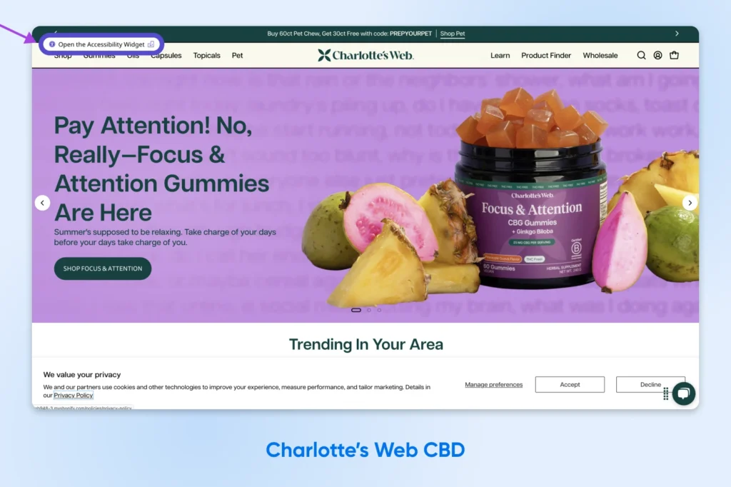
Charlotte’s Web puts accessibility first with a dual skip link “Skip to content”/”Open the Accessibility Widget”) that appears in high contrast over the top of any promotions.
Large 20 px fonts and generous line-height comply with readability guidelines, and every product image includes potency info in the alt text —crucial context for shoppers looking for CBD dosing information.
7. Beardbrand
Following an ADA lawsuit, Beardbrand did its homework. A skip link leads the tab order, and a footer callout invites “Shoppers with disabilities” to phone or email for assistance —an inclusive service layer many small brands don’t offer.
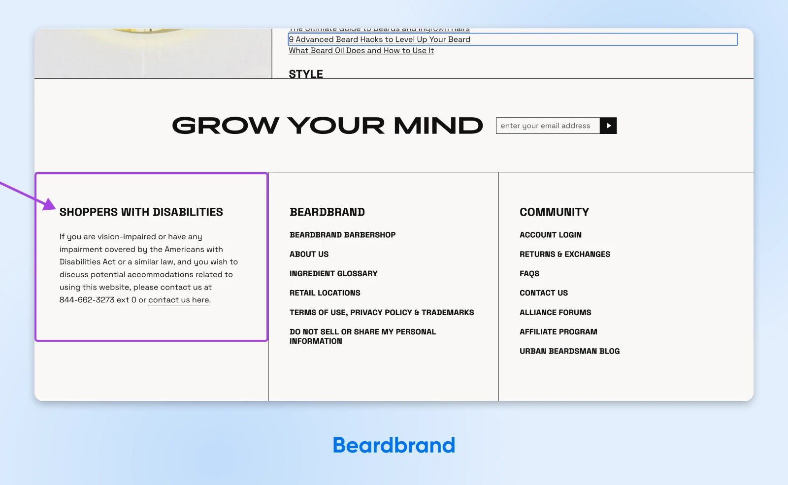
Additionally, focus rings are extra-thick around any small UI elements like quantity steppers, preventing “where did my cursor go?” confusion for low-vision users.
Before taking any steps to redesign your site, it’s a good idea to start by knowing where it currently stands, how it measures up against accessibility standards and best practices, and what accessibility barriers you may need to overcome with changes or redesigns.
There are many ways to check your site’s accessibility. Let’s explore a few of the easiest and most popular options.
Mini Accessibility Roadmap: 3 Fixes You Can Ship This Week
Looking for some quick accessibility wins? While improving web accessibility is a marathon, not a sprint, some fixes don’t take a lot of time. Here are three you can put into practice this week to immediately improve your site’s UX for visitors with disabilities.
1. Write Alt Text for Every Hero Image
Every image on your site should have a corresponding alt text that accurately and succinctly describes the image’s content or function. Take 15 minutes per page and describe the image’s purpose, not the pixels.
This description should convey the same message that the image does for sighted users.
2. Add A “Skip To Content” Link
This allows users who rely on keyboards to bypass repetitive navigation links and directly access the primary content, and you should have one at the top of every page.
Test this by tabbing through the page yourself to make sure it’s highly visible —and works correctly.
3. Run a Lighthouse Audit and Tackle the Top 3 Red Flags
Focus on high-impact items like missing form labels or low-contrast buttons. Repeat this each week, and soon you’ll have no more accessibility issues to fix.
Make It Easy for Everyone To Access Your Site
Perfect accessibility rarely happens overnight, and that’s okay. Each tweak widens your welcome mat: for customers on five-inch phones, 55-inch monitors, and everything in between. Start with one win today, test tomorrow, and keep iterating.
Need a wing-person? DreamHost Pro Services can audit your WordPress theme, squash compliance issues, and even migrate you to an accessibility-optimized hosting stack. Your future customers — plus your conversion rate — will thank you.


