7 A/B Testing Examples (Proof that Experimentation Works)

It’s normal not always knowing exactly where to start when you’re planning to run conversion rate optimization (CRO) experiments. Even if you met the A/B testing basics, got a hypothesis, isolated variables, a reasonable sample size, and statistical significance.
That’s why A/B testing examples in marketing somehow contribute to illustrate and set expectations on what A/B tests may look like so you can borrow inspiration and implement changes down the road.
Right now, I’m about to share 7 real-world examples of A/B testing with the goal, approach, outcome, and my takeaway behind each.
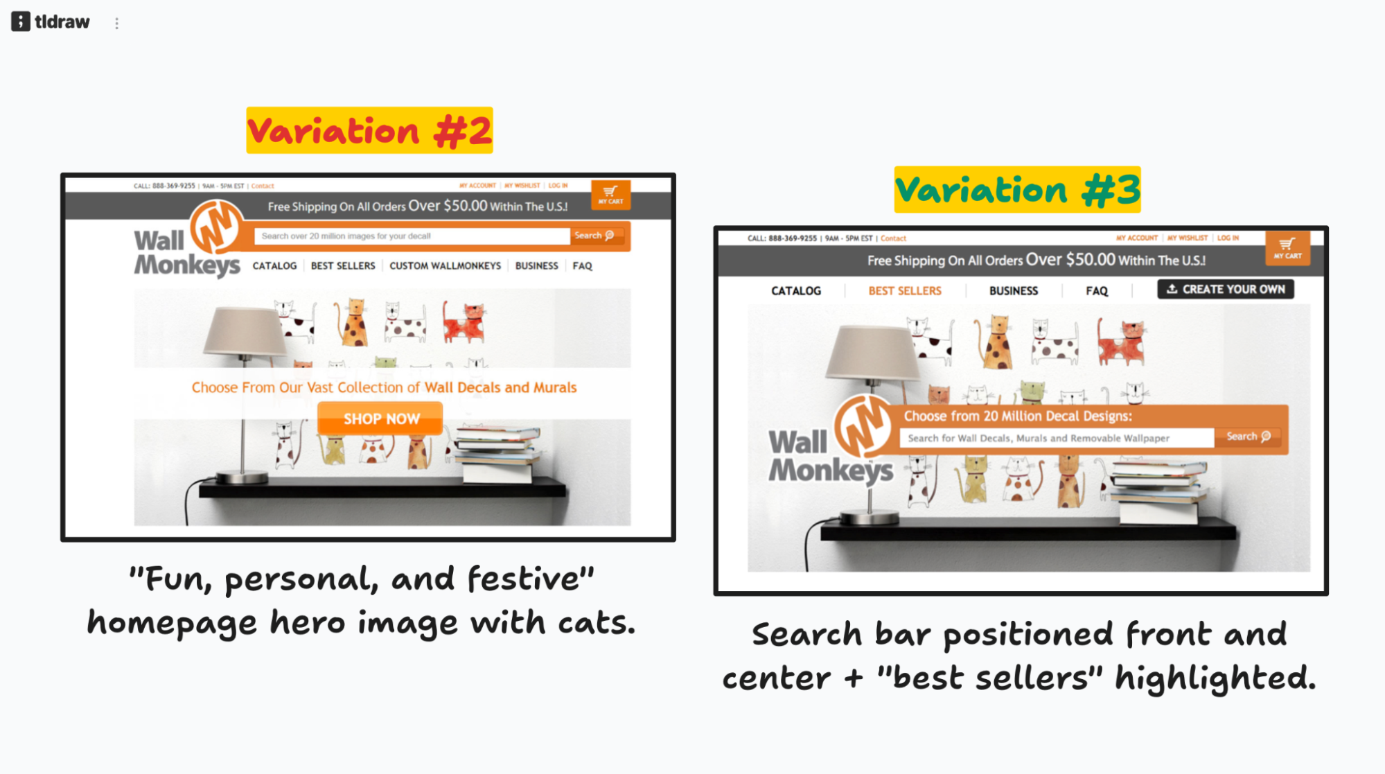
1. Wallmonkeys – Imagery/visual layout, followed by repositioning the search bar.

This is textbook CRO. Wallmonkeys is one of the world’s largest printers of custom wall decals, murals, and removable wallpaper. It offers peel-and-stick designs for homes, offices, and businesses.
So what exactly makes this A/B testing example so good?
Instead of guessing, Wallmonkeys looked at user behavior data to swap a hero image from a standard product shot to something more resonating with the brand’s main audience. And replaced an underperforming CTA with a search bar positioned front and center.
Goal: Identify areas of UX improvement (backed with behavioral data from visitors) to change visuals/layout and boost conversions.

Approach: Wallmonkeys started with a heatmap analysis using Crazy Egg to see what users did on the home. The data showed that web visitors weren’t clicking “Shop Now.” Visitors did search for products right away. With this insight, the Willmonkeys team ran sequential A/B tests to iterate on the learnings from experiments.

Outcome(s): The image swap landed on a 27% conversion rate increase. And the search bar repositioning, 550% conversion lift.
My takeaway: Avoid fighting against natural patterns or testing an hypothesis once and calling it done. Ideally, A/B testing should be an ongoing and intentional action. That validated behavioral approach probably influences how Wallmonkeys design landing pages visuals/layouts for specific collections, and campaigns.
Read the full Wallmonkeys case study.

TSheets (now QuickBooks Time) faced this problem. Users were scrolling, reading, and evidently interested in the pricing page. Yet 50% of potential customers were bouncing before signing up.
Mike Loveridge, Head of CRO at TSheets, analyzed the data and discovered something unexpected. Through Crazy Egg recordings, he watched users engage with the pricing content, then scroll back up and exit through the header navigation. “We wouldn’t have known that if we hadn’t watched the recordings,” Mike said.
The very navigation header menu, designed in most scenarios to guide visitors, was pulling them out from the conversion funnel.
Goal: Experiment with a scaled-down navigation version on a PPC landing page to potentially reduce the drop-offs from the pricing page. The hypothesis was that fewer navigation options would prevent distractions and keep prospects focused on converting.
Approach: Mike checked Google Analytics and Optimizely tests to see where people were dropping off. Then Crazy Egg recordings revealed the behavior behind those numbers. Which led to a clear hypothesis about navigation interference. The plan was testing the simplified navigation on paid traffic first, then roll it out if successful.
Outcome(s): While the results weren’t available at the time of documentation, the win was the experimentation-forward culture. This motion helped TSheets scale to 20 A/B tests p/month. As Mike put it, “It’s amazing how different everything is at the company when you have that additional customer data to work with.”
My takeaway: Sometimes a company’s conversion obstacle is the most obvious one. Like an overloaded (albeit helpful) navigation menu that might be sabotaging business goals. I think the smart way to go about it is combining quantitative and qualitative data to understand friction. Not what one assumes should be happening.
3. Miller & Smith – Updating web content and labels/links based on click insights.

As you’ve probably guessed by now, Miller & Smith is a real estate developer and homebuilder. The company specifically builds quality residential properties, townhomes, condominiums, and mixed-use developments mainly across Maryland, Virginia, and Delaware.
But here’s what, in my opinion, makes this “A/B testing example” interesting. It’s not about the A/B testing part per se, but the groundwork that happens prior to executing experiments.
When Erica Bell joined Miller and Smith as marketing manager, she inherited a professional-looking website with no behavioral insights.
“The main thing we needed was help understanding our audience,” she explained. “We had a pretty website, but we needed more info to see how our visitors were interacting with each page of the site.”
Without this baseline, A/B tests would’ve been shots in the dark.

Goal: Gain context of web visitor behavior to optimize usability and UX. All this to lay the foundation for then running A/B tests, increasing conversions, and reducing bounce rates.
Approach: With Crazy Egg’s heatmaps and recordings tracking user behavior, the team analyzed where visitors clicked, scrolled, and spent time, looking for patterns in navigation and interaction. This visual data created a roadmap for future A/B testing priorities.
Outcome(s): 7.5% decrease in bounce rate, and an 8.5% increase in goal conversion. Visitors consistently scrolled past hero images to find floor plans. Users clicked on unlinked text expecting it to be actionable. And visitors spent time browsing image galleries.
My takeaway: This case study demonstrates how observing user behavior can be valuable as A/B testing prep work. The visual evidence made it easy for Erica to get team buy-in: “Having those visuals and seeing the recordings, and the heatmaps, made it easy for me to explain the issues, and for the team to understand them.”
4. Sendible – Browser-specific flow + journey tweaks for returning visitors.

Sendible is a social media management tool designed for brands and agencies who want to manage social media channels at scale. Under Veronika Vebere’s marketing leadership, Sendible changed the way it used to take care of CRO with A/B testing software.
Goal: The situation in question. Veronika needed better insights into visitor behavior to understand how people interacted with the site before starting trials. So she switched to Crazy Egg because Hotjar didn’t capture Sendible’s top navigation menu interactions and couldn’t tell the difference between new and returning visitors.
Approach: Most teams jump straight into A/B testing whatever comes to mind. Veronika took a different path. She implemented Crazy Egg’s confetti reports and analytics to pinpoint behavioral patterns worth testing personalized experiences for. And potential technical issues that would guide a set of optimization actions, too.
Outcome(s): 10+ work hours saved monthly. Veronika said: “With the confetti report’s new vs. returning visitor analytics, I can look at the returning visitors and see what actions they have taken.” Less testing random variations. More Sendible having data-backed hypotheses about visitor segments and technical problems.
Besides, Veronika found that Mozilla Firefox users (5% of pricing page visitors) were experiencing readability issues that likely hurt conversions. Which presented another A/B test to play around with.
My takeaway: Solid A/B testing starts with understanding web user behavior before anything else. In other words, getting familiar with the real pain points and friction that impact specific user segments. Sendible’s example proved that the research phase isn’t separate from testing. In fact, it serves as an experimentation foundation.
Read the full Sendible case study.
5. Tim Ferriss – Segment click-tracking to focus on high-value target audiences

Bestselling author and entrepreneur, known for “The 4-Hour Work Week,” Tim Ferriss. He’s built a personal brand around finding data-driven ways to maximize results with minimal input. Whether that’s learning languages, doing business, or optimizing a lifestyle.
Goal: Determine the profitable target audience segments of The Blog of Author Tim Ferriss, and understand those folks’ specific behavior patterns to optimize his home’s most valuable real estate. He’s intentionally testing for the right clicks from the right people.
Approach: After every single homepage redesign, Tim runs the same operating procedure with Crazy Egg’s confetti reports. He sets up A/B tests for 5,000 clicks, implements 2 lines of JavaScript for automatic tracking, then just analyzes click patterns by traffic source. The rest is repeating the process for each change.

“I can select or deselect sources of traffic to see where people are clicking. And you learn some very interesting things.” He adds.
Outcome(s): Behavioral nuances between audience segments. US traffic frequently clicked the “Most popular of all time” section in the blog’s upper right sidebar (which turned out to be valuable real estate). Tim even joked about it, “Americans don’t care at all about my favorites,” while “Germans will click on Tim’s favorites.”
My takeaway: This approach works because it crosses multiple optimization axes simultaneously (copy, UX, and personalization). This lets Tim make strategic decisions about his most valuable digital real estate based on actual user behavior, not assumptions.
6. Radio Free Europe/Radio Liberty – UX improvements through heatmap iterations

Radio Free Europe/Radio Liberty operates as a lifeline for press freedom across 20 countries where free press is banned/restricted. With +100 websites globally, RFE/RL’s digital presence matters to deliver uncensored news to regions under authoritarian control.
RFE/RL dealt with a common problem. Editorial teams assuming what content readers wanted most and where to position it for maximum impact. These assumptions didn’t always reflect reality, especially when serving audiences in restrictive environments.
Goal: Identify the best content presentation patterns in the home design, understand reader interaction across pages, and get some idea if with certain article layout, content is partially/fully consumed.
Approach: Iterative heat mapping. Instead of making redesigns based on guesswork, RFE/RL developed a systematic testing tactic using Crazy Egg’s heatmaps. The process went more or less like this. Analyzing performance, making layout A/B tests, evaluating results, and repeating until achieving optimal reader engagement.
Product Director Arkady Pildes explains: “Working with news, we assume that the most recent and the most important content should be consumed the most. On the home pages, we expect a proportional gradient on the scroll maps, hotter click spots on the top stories.” These expectations, though, weren’t always accurate.
Outcome(s): Higher reader engagement for teams that analyzed and acted on heatmap data. Understanding of where people stop reading or scrolling on articles. And recommendations for homepage/content layout updates to improve the UX.
My takeaway: From RFE/RL’s methodology I can say that all the consistent, iterative testing outperforms sporadic major overhauls every time. Making small layout changes, analyzing results, and continuing until reaching desired engagement levels creates a sustainable optimization process that keeps improving over time.

Family-owned business Happy Trails sells off-road motorcycle parts, gear, and accessories online. When Casey Ralls became co-owner and web and marketing director in January 2020, he got a broken eCommerce that was losing sales due to technical issues.
Goal: Use behavioral data to spot optimization opportunities that could then be systematically tested and validated through A/B testing to maximize conversions and reduce cart abandonment.
Approach: Analyzed Crazy Egg recordings and heatmaps to locate friction points. Identified mobile usability issues affecting 60% of site traffic. Found checkout bottlenecks. And discovered inventory display problems that undermined shopper confidence.
Outcome(s): Happy Trails sales jumped 30-35%/mo. Recovered over $90,000 in previously lost sales through data-driven changes. Uncovered high-impact A/B testing opportunities. Found elements buried below the fold. Revealed mobile-specific optimization needs.
My takeaway: Casey created A/B testing opportunities. He had the scenarios (original layouts vs variations) but missed the chance to measure which changes exactly worked best. Behavioral data should feed A/B testing experiments. Analytics suggests what to test, while testing validates how to implement those insights.
Read the full Happy Trails case study.