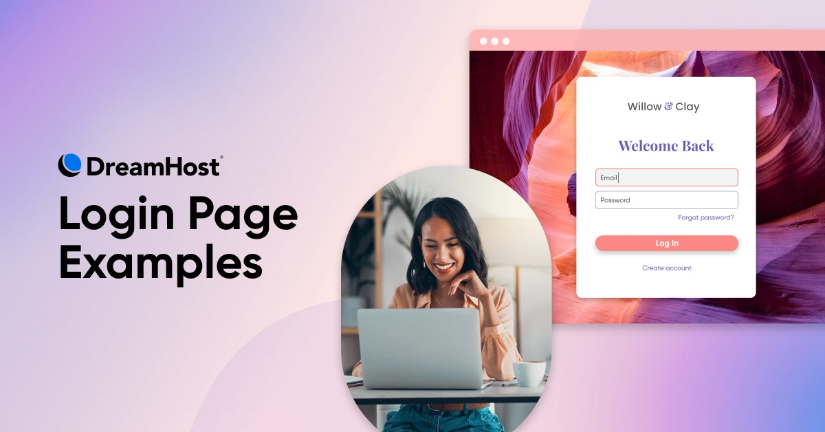
15 Login Page Examples That Welcome Users in Style

There’s nothing on TV, so you’re doing a little web surfing on your phone.
Your finger lands on a bookmark you haven’t opened for a while. Wow, seems like they’ve made some recent upgrades!
You’re pretty sure you have an account on this site. But which email was it? What was the password? The login page offers no clues, and apparently the upgrades missed this page. It’s butt-ugly.
Maybe there’s a reason you stopped visiting the site.
For a site owner, this reads like a horror story. Really, though, it’s more of a cautionary tale. You need to nail your login page design — or else…
via GIPHY
Wondering where to start? In this guide, we’re serving up the greatest examples of login page design known to humankind — with the technical context to help you deliver stunning UX.
Let’s dive in!
Examples for When Your Customers Need Trust Signals
Your login page is the front door of your site. Or maybe the drawbridge to your castle.
It should provide easy access for genuine users and prevent bad actors from breaking in.
Your users understand this instinctively. And they’re keen to see that you’re taking security seriously.
The following examples provide plenty of reassurance, making them well-suited to sites that rely on trust: finance, healthcare, and the like.
1. Stripe: Clean Design With Security Signposting
Payment processor Stripe has a simple yet effective login page. The design style is minimal, but there are plenty of clues to suggest they’re running a secure operation.
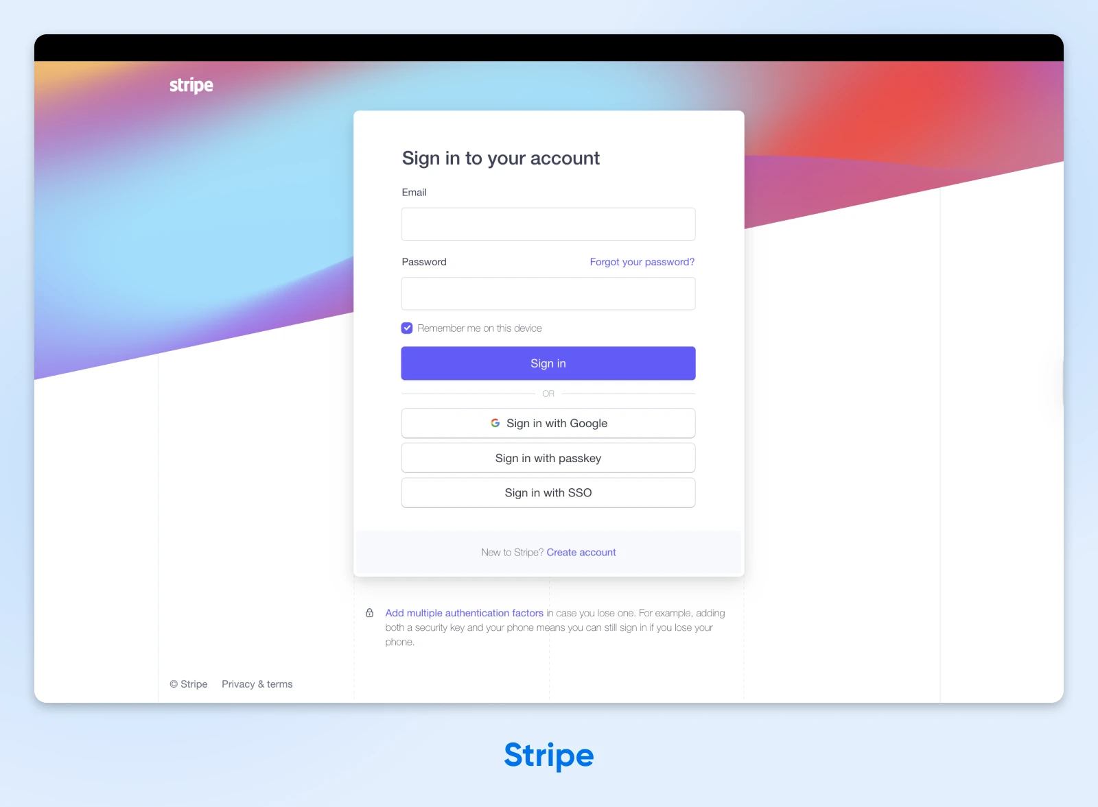
What we love:
- Multiple, secure login methods: Stripe serves up WebAuthn, biometrics, and SSO right off the bat. That means users can easily choose the method they trust.
- Two-factor authentication in the spotlight: That subtle nudge below the main form encourages users to protect their account. It also helps to build on the secure vibe.
- Simple, subtle branding: Stripe’s users are rushed business owners. This login page keeps things simple, while providing enough branding to reassure users that, “Yes, this is the right page.”
Implementation notes:
- Stripe has used WebGL to create a colorful, animated backdrop.
- All aria-* attributes are filled out and match their roles. This is a great move for accessibility because it allows screen readers to navigate the form.
Key takeaway: It’s possible to build trust and reduce friction in the same design.
2. MyChart: Branded Privacy for Healthcare
You don’t need to be called Sherlock to find the privacy credentials on MyChart. The login page for this healthcare platform wraps an impressive security CV inside custom branding.
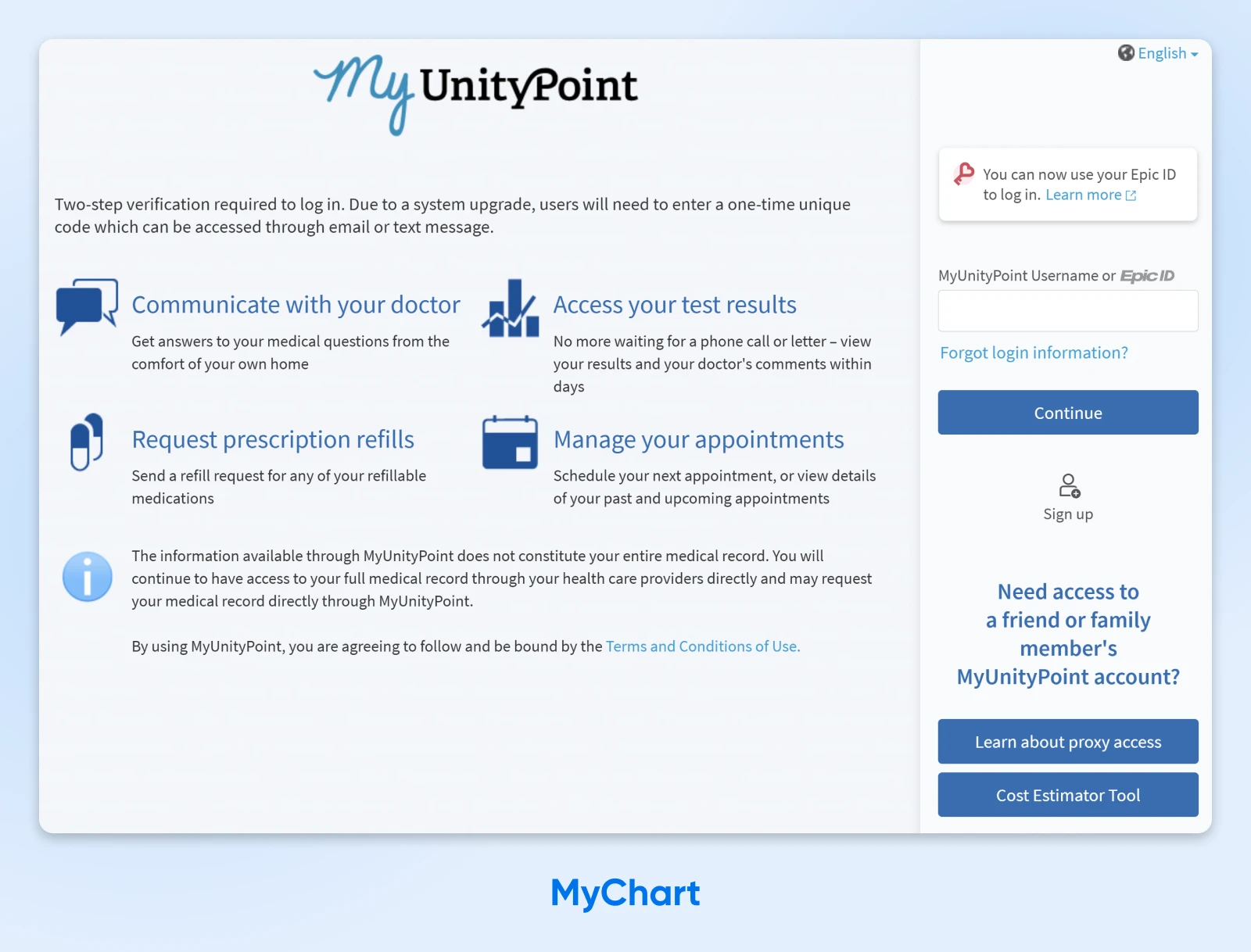
Why it works:
- Co-branding with the specific healthcare provider: This reassures patients they’re in the right place.
- Visibility toggle on the password field: Users can check they are entering the right characters, but still maintain privacy.
- Support for multiple languages: Spanish speakers can quickly switch to their native language via a link in the top-right, and other languages are catered for via the info button.
Implementation notes:
- For healthcare, accessibility is the top priority. Use clear labels and strong contrast.
- MyChart offers a “Guest pay” option that doesn’t require a full login — great for smoother UX.
Key takeaway: Simple, accessible design is always better than something flashy.
3. Barclays Bank: Security Theater in a Good Cause
Some sites put on a show to deceive users. But Barclays uses a little theater to provide visible signs of underlying security. It’s a five-star review from us.
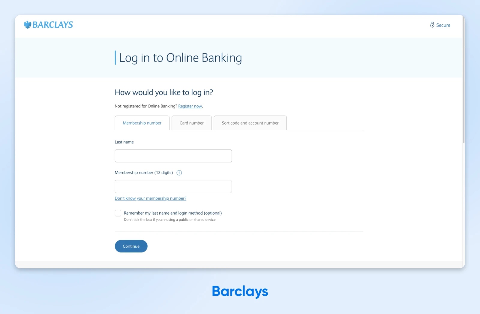
Why it works:
- Explicit trust signals are displayed prominently: The “Secure” link in the top-right provides reassurance, and it links to a page about Barclays’ security measures.
- Helpful FAQs on the login page: To calm panicked users who are struggling with login, Barclays provides some helpful troubleshooting tips.
- Official, understated branding: The design here is the equivalent of a suit and tie: smart, trustworthy, and professional.
Implementation notes:
- For high-security sites and apps, consider offering flexible identifiers (e.g., username, email, phone).
- HSTS forces browsers to use the secure https:// version of the site.
Key takeaway: If you’re doing the work on security, there’s nothing wrong with flaunting it.
4. Bank of America: Trust Through Transparency
One good way to earn the trust of users is by being really honest and open. That’s the track Bank of America has taken with its login page, to good effect.
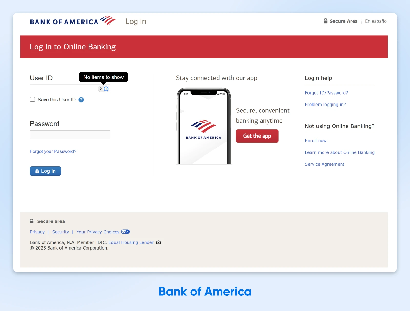
Why it works:
- FDIC insurance is prominently displayed: The government-backed message at the top immediately says this page is legit.
- Multi-layered support options: Two distinct help sections (“Login help,” “Not using Online Banking?”) with sub-queries anticipate different user needs, without cluttering the main form.
- Mobile app promotion with context: The bank walks through the security and convenience benefits, building trust in the mobile channel.
Implementation notes:
- Notice that users log in via a unique ID number, rather than with their email. This extra layer of protection is a good idea for financial platforms.
- In the footer, the “Your Privacy Choices” opt-out shows CCPA compliance and respect for user data rights.
Key takeaway: You can include plenty of options and information on your login page — just keep things sectioned to avoid creating clutter.
When Simplicity Is Everything
Not every login page needs to boast about security.
If someone is just trying to stream their favorite songs or make a digital note, speed and ease of use should be the top priorities.
Here are some powerful examples of low-friction login pages:
5. Spotify: Guiding the User To Speed Up Login
Many login pages still prioritize the email address and password combination. But Spotify puts OAuth first, allowing users to log in with accounts they might be signed into. Music lovers, rejoice.

Why it works:
- Secure, low-friction login methods get priority: OAuth is both more secure and more convenient for most users, so Spotify serves up these options first.
- Branding that improves usability: Spotify’s luminous green brand colors help to highlight the most important features here, including the helpful “Remember Me” toggle.
- Fallbacks within easy reach: If you don’t have an account or can’t remember your password, the remedy is in plain sight.
Implementation notes:
- Built with React, core-js, and styled-components.
- Order your login options to match your audience usage. Keep the layout consistent to aid user muscle memory.
Key takeaway: Most users prefer social logins, and they’re generally regarded as more secure.
6. Notion: One Field, Zero Friction
There’s nothing flashy about Notion’s login page — and that perfectly matches the pared-back aesthetic of this note-taking platform. The main attraction here? Great login flows.
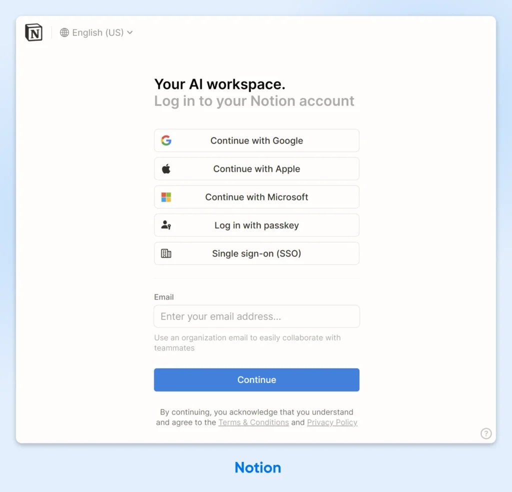
Why it works:
- Emphasis on zero-typing flows: Users have a heap of easy login options to choose from, and each is clearly signposted with an icon.
- Magic link as the native path: Enter your email, get a link, click to log in. No passwords to remember or type.
- Progressive disclosure done right: The interface only shows what you need, when you need it. Password fields appear only if you choose that route.
Implementation notes:
- If your product is targeting teams, SSO integration (SAML, Okta) is essential.
- Use smart input detection to validate email formats automatically. It can save a whole heap of typo-related frustration.
Key takeaway: Hiding the password field can encourage more secure login methods.
7. Slack: Quick Access to All Your Workspaces
Although Slack is just a messaging platform, it has a unique challenge for login: many users belong to multiple workspaces. To get around this issue, Slack has developed a really smart sign-in page.
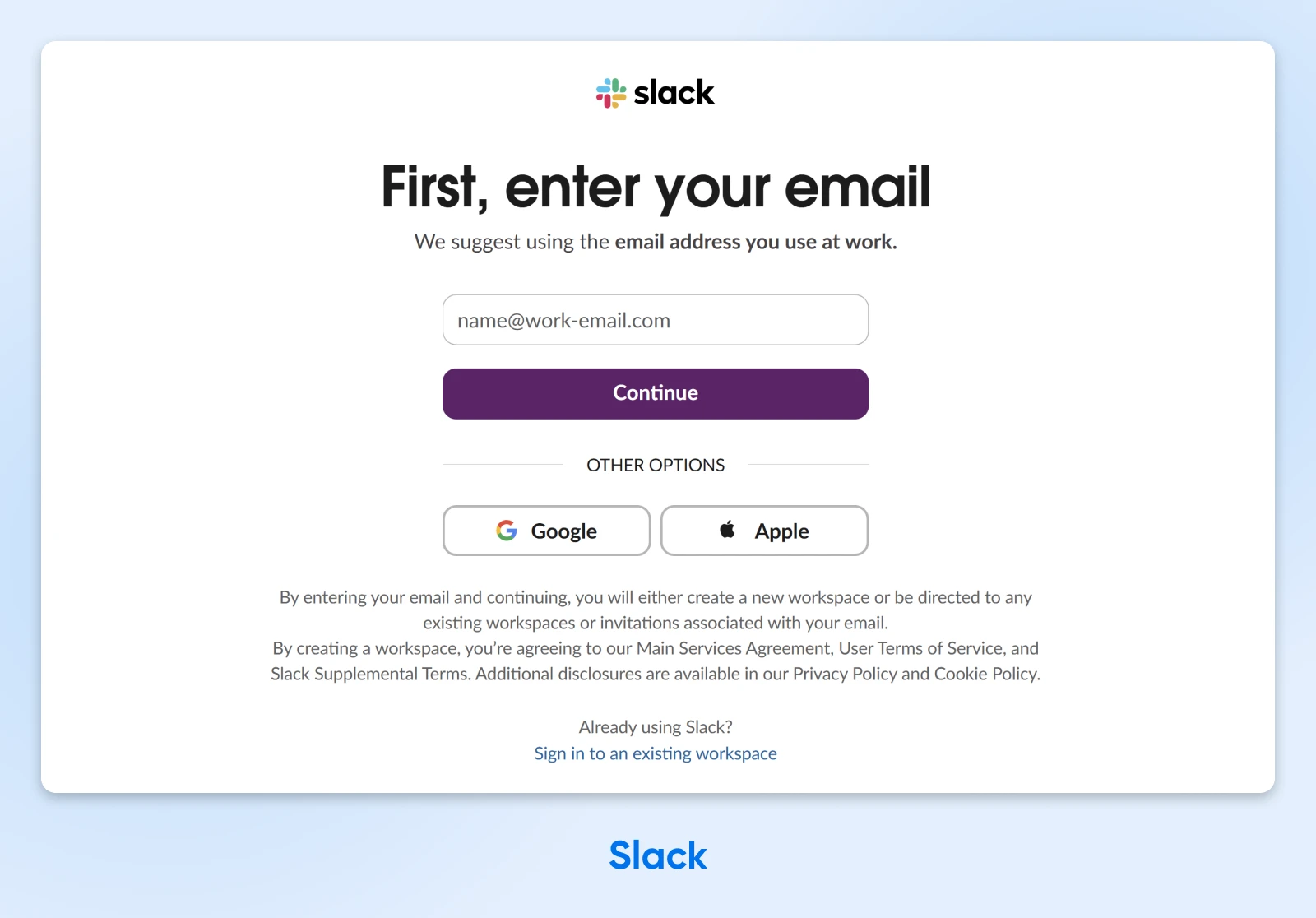
Why it works:
- Email-first approach guides you toward the entrance: Enter your email, and Slack finds all your workspaces; no need to remember company URLs.
- Clear workspace switcher: Already signed in somewhere? The workspace grid lets you jump between teams with a click.
- A more convenient default: The Google sign-in option gets headline billing here, because many workplace accounts use Google Workspace.
Implementation notes:
- If your app supports multiple accounts or organizations, build quick-switch functionality.
- Magic link login as the default means users don’t have to store or remember their passwords for multiple workspaces.
Key takeaway: You can allow multiple accounts on the same platform without causing your users headaches at login.
8. Shopify: Made for Merchants
While Shopify caters to a different audience, it’s still a venue for work. The login page for this e-commerce platform allows merchants to get on with their job without solving a puzzle first.

Why it works:
- Attractive, focused design: The gradient background adds visual interest, while the white card keeps focus on the login actions.
- Passkey authentication prominently placed: The “Sign in with passkey” option shows that Shopify is embracing best practices in security.
- Social login for convenience: Apple, Facebook, and Google options cater to different user preferences and provide quick one-click access.
Implementation notes:
- Shopify is a famous example of a platform built with Ruby on Rails.
- Add a passkey option to your own login via the WebAuthn API.
Key takeaway: B2B login pages should be optimized for repeated daily use, not one-time conversions.
Community platforms have to strike a delicate balance. You want your network to feel secure, but you don’t want a bouncer on the door who terrorizes the regulars.
These examples show how it’s possible to be strong yet welcoming with your login screen.
9. Discord: Gaming-Inspired Login
Discord‘s login feels less like a security checkpoint and more like joining an online multiplayer lobby. This is partly down to the fact that many users are gamers, but the vibe works well for other communities, too.
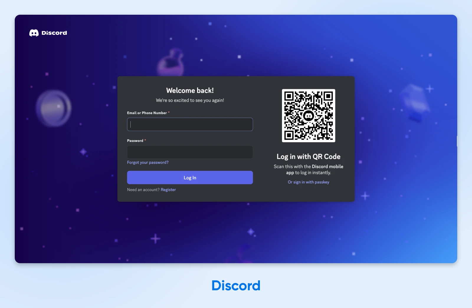
Why it works:
- A friendly welcome: Not one, but two greetings ending in exclamation marks. Discord is pumped to see returning users.
- QR code login for mobile users: Users can scan with their phone if they’re already logged in there; brilliant for users switching between devices.
- Username-first approach: Unlike email-centric platforms, Discord knows its users identify by their handles.
Implementation notes:
- To offer QR logins, issue a short-lived login token on the server, encode it in a QR code, and watch for redemption via WebSocket.
- A subtle branded background can make your page feel lively, without distracting from the login flow.
Key takeaway: Your login page should reflect your community’s personality.
10. Pinterest: Visual Interest Before You Sign In
As a community for sharing images, Pinterest is a very visual platform. It’s no surprise to learn that the login page is pure eye-candy.
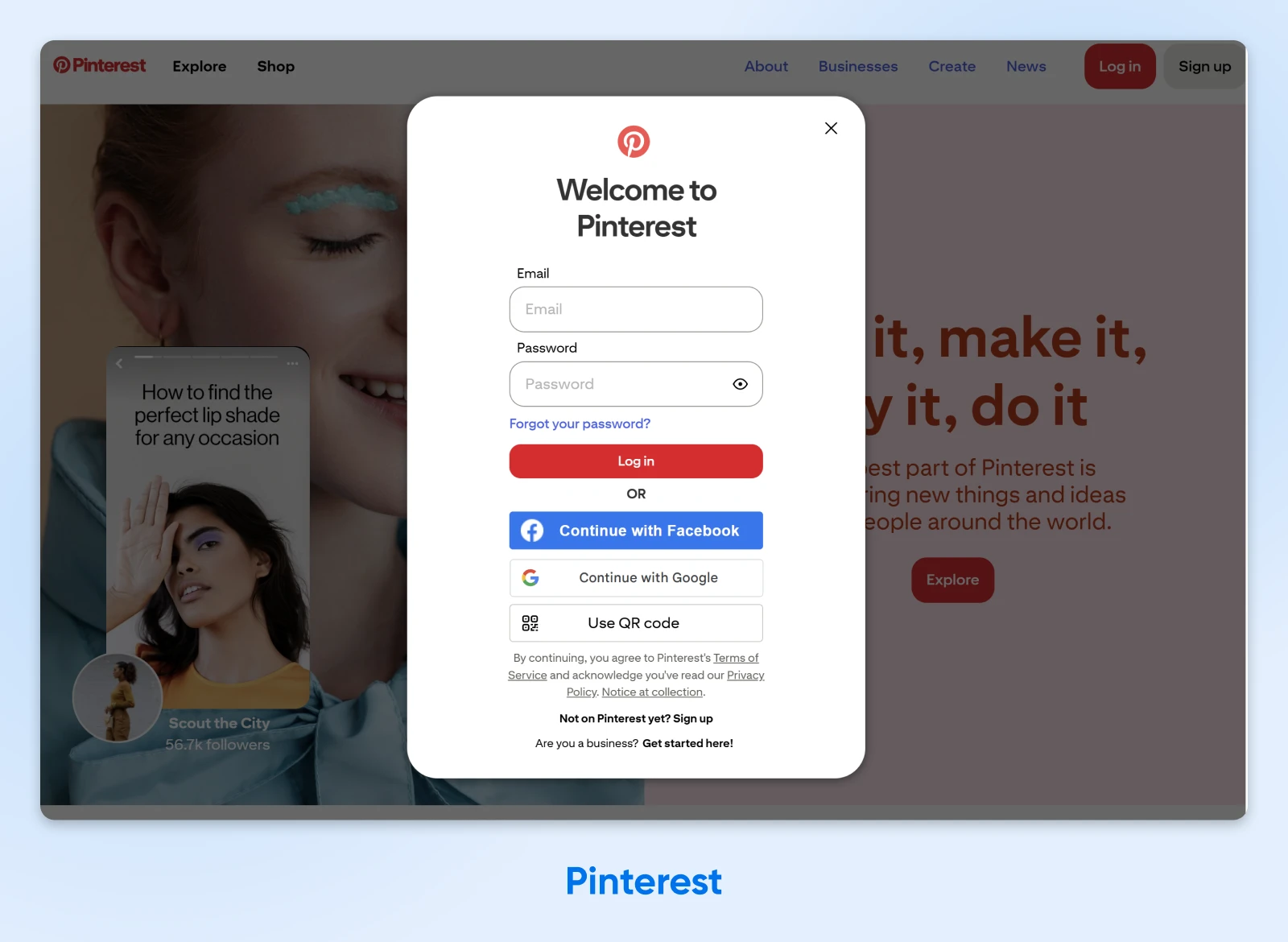
Why it works:
- A design that invites you in: The background previews Pinterest’s signature masonry post layout, giving users a sense of anticipation.
- Built-in bot and spam detection: Pinterest uses reCAPTCHA at login to prevent people from making fake accounts.
- Large input fields for better mobile usability: A huge portion of community users visit from phones and tablets.
Implementation notes:
- While gamers and developers feel at home in night mode, most users prefer something brighter.
- If you’re trying to encourage growth, consider making the “Sign up” as prominent as “Log in.”
Key takeaway: Respect user privacy preferences while making the benefits of accounts clear.
11. Medium: Straight to the Content
Blogging platform, Medium, has two types of users: those who read and those who write. Both groups are directed to the same, stripped-back login page.
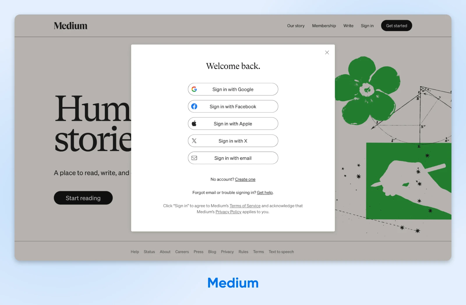
Why it works:
- Email login is the last resort: Medium pushes you toward OAuth providers; you’ll only see a traditional login form if you choose email sign-in.
- Minimal interruption to reading flow: On most pages, the login form appears as a window above the content you’re viewing.
- Engaging fallback options: The question and answer format guides users toward the solution to their problem. For example: “Forgot email or trouble signing in? Get help.”
Implementation notes:
- Consider using modal overlays rather than separate login pages. This allows users to continue on their journey without getting distracted by the login flow.
- Track where users hit the login wall to optimize when you should ask for authentication.
Key takeaway: Login shouldn’t divert the user journey.
When E-commerce Conversion Is Key
For e-commerce sites, even the slightest friction can result in abandoned carts and lost revenue. And that includes login.
Here are some examples of online stores that keep shoppers happy.
12. Amazon: Brutal Optimization
You won’t find a more optimized online store than Amazon. The login page is no exception. The design is ruthlessly simple, leaving little room for confusion.

Why it works:
- Choose email or phone number: Users can log in with whichever ID they can remember.
- “Keep me signed in” is checked by default: A little controversial, but this does mean that customers don’t have to keep signing in every time they shop.
- Instant account creation option: New users can create accounts without leaving the flow.
Implementation notes:
- Amazon uses extensive A/B testing to run experiments on key areas of the site — a habit that smaller stores should copy.
- Session tokens use rolling expiration for solid security without endless re-authentication.
Key takeaway: In e-commerce, every click that adds friction costs conversions, so minimize them ruthlessly.
13. Nike: Join the Fashion Club
Nike‘s login page feels less like security and more like entering an exclusive club. There’s just one field, with the rest of the design dedicated to white space and iconic logos.
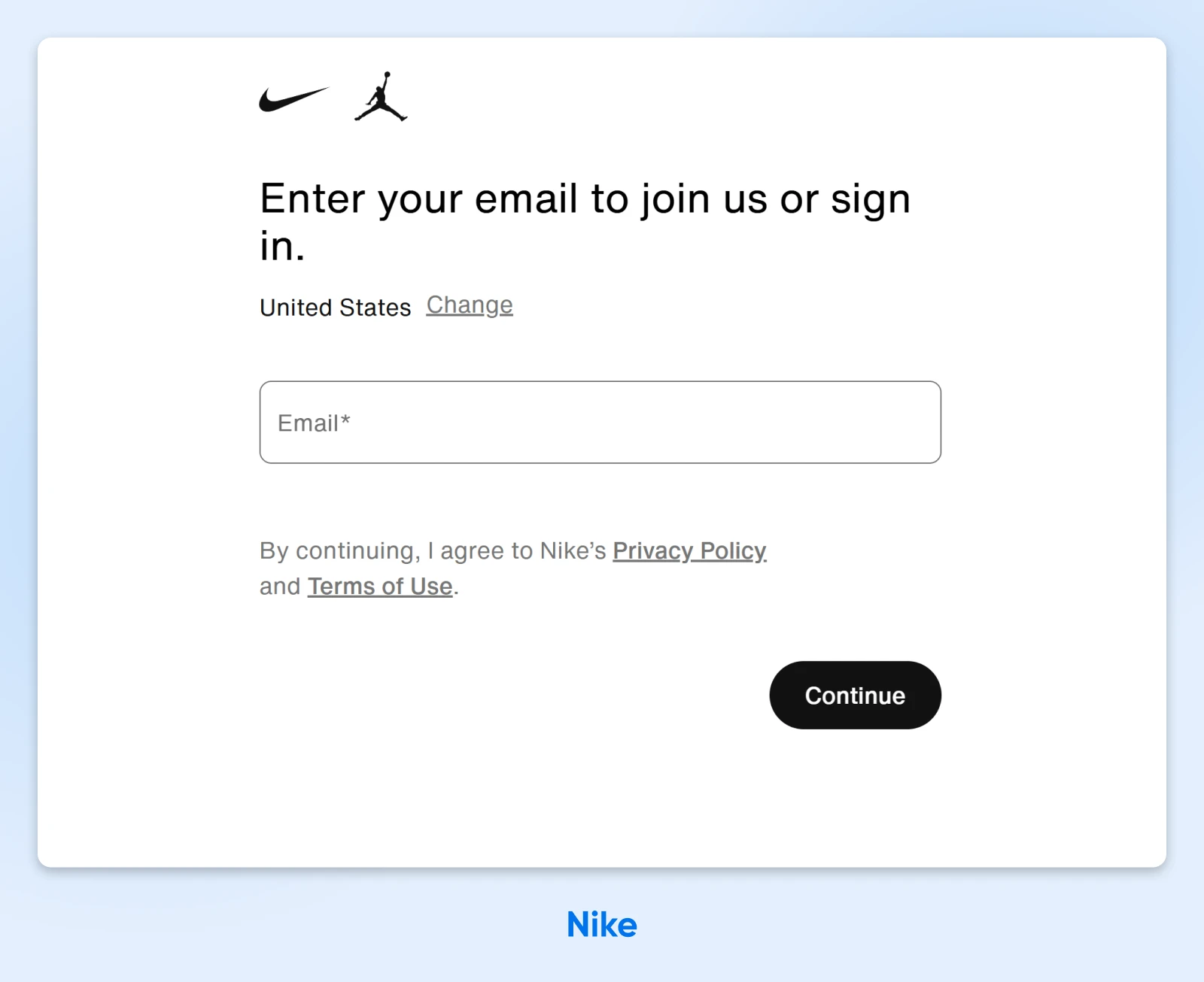
Why it works:
- Strong brand imagery: The swoosh and the Jordan silhouette are small in size, but bold in visual impact.
- Member benefits emphasized: “Join us” messaging focuses on perks, not obligations.
- Combined login and sign-up flow: There’s only one track here, and it starts with putting in your email. From there, you’ll either sign in or create an account.
Implementation notes:
- This login page is built using a mix of React, Emotion, and core-js.
- Note the location picker; this allows Nike to serve up the right privacy policy for visitors in each region.
Key takeaway: Luxury and lifestyle brands should make login feel like joining something special.
14. ASOS: Built for Sign-Ups
Combining login and sign-up flows is a common tactic in e-commerce. The trick is to avoid annoying returning customers. ASOS strikes a nice balance, encouraging customers to create an account without ruining the login flow.
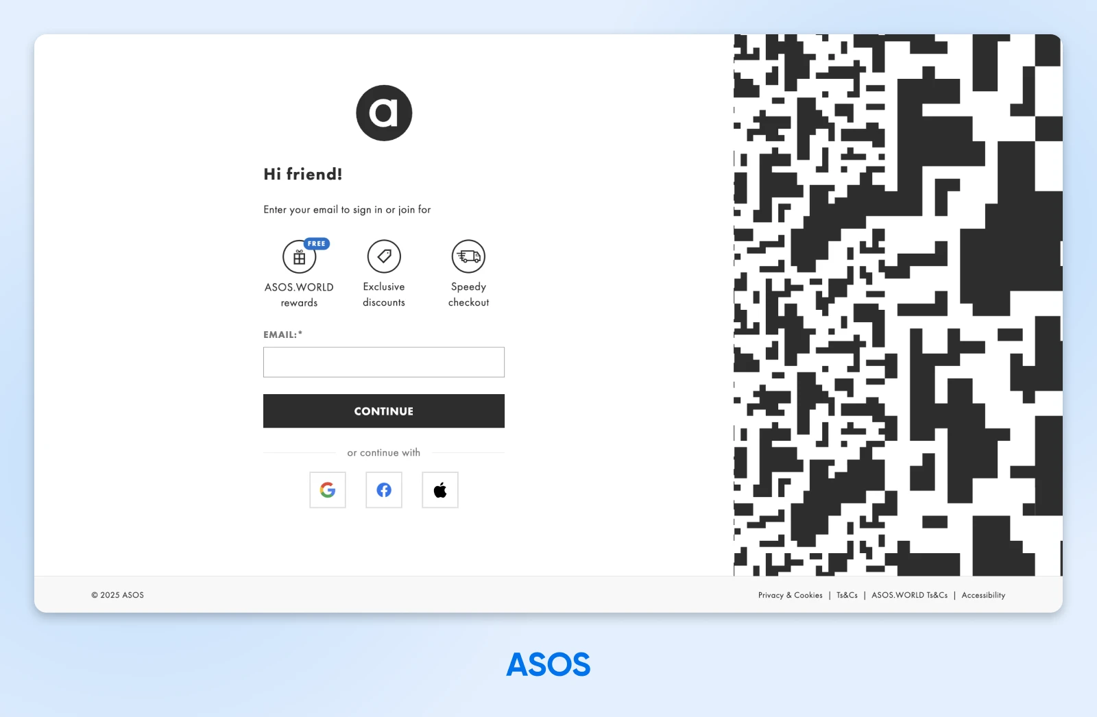
Why it works:
- Benefits-first messaging: ASOS hits users with several reasons to create an account, if they haven’t already done so.
- Strategic use of color: Most elements of the login page are black and white. Other colors are reserved for key elements, such as the OAuth buttons and the “FREE” label.
- Left-aligned form to catch the eye: Research shows that we scan from the top-left when a webpage loads.
Implementation notes:
- This page uses Preact, a tiny alternative to React, to deliver very snappy performance.
- In this example, the benefits of signing up are communicated through simple illustrations and labels — but you could add links to more info.
Key takeaway: Users are more likely to bother creating an account if you sell the benefits up front.
15. IKEA: Complete Clarity
One of the best ways to reduce friction is to set expectations early. IKEA does this perfectly, informing users from the start that they’ll receive a one-time code via email.
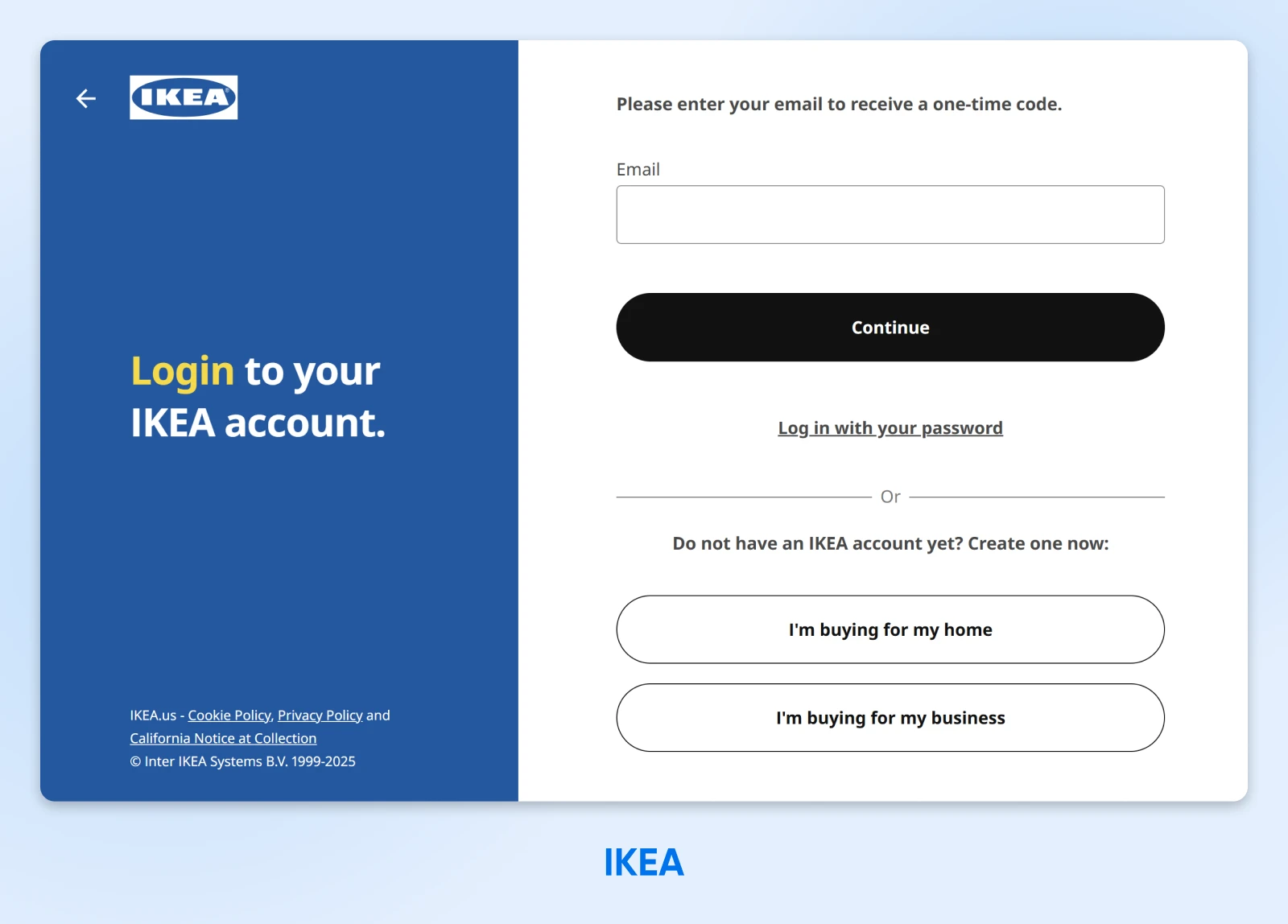
Why it works:
- Design that funnels users toward 2FA: While IKEA allows you to log in with your password, the visual hierarchy of the page guides you toward using a one-time code.
- Clear, concise copy: Users get clear instructions. We particularly like this one: “Please enter your email to receive a one-time code.”
- Separated branding for better usability: Building a form using IKEA’s brand colors (bold blue and yellow) would be a challenge, so the design team chose a split layout.
Implementation notes:
- This login page was made with Java, React, and styled-components.
- CAPTCHA isn’t the only way to beat the bots; IKEA is using Cloudflare Turnstile as an alternative.
Key takeaway: You don’t have to force branding into your login form.
The 7 Commandments of Login Page Excellence
We’ve just toured 15 login pages, like judges for a UX beauty pageant. But what have we really learned?
Here are some of the key takeaways:
Good start, but we promised seven commandments. So, here are some more principles of great login design:
Give Your Users the Login They Deserve
Whether you’re building the next Facebook or just setting up comments on your blog, it’s worth paying some attention to your login page.
Your choice of design, login flow, and security can really impact how users will feel about your site. It can also be the difference between visitors rage-quitting your website or sticking around for years to come.
Working on a site right now? Consider hosting it with DreamHost. We have over 400,000 happy customers, and transparent pricing that works for any project.
Sign up today to join the party!

Pro Services – Web Design
DreamHost Makes Web Design Easy
Our designers can create a gorgeous website from SCRATCH to perfectly match your brand and vision — all coded with WordPress so you can manage your content going forward.
Learn More
Did you enjoy this article?