12 Photography Website Examples That Just *Click*


The great thing about taking pictures is that, with a good eye and the patience to develop it, you can turn this passion into pay —if you go about it the right way.
But if you don’t have a plan for transforming this pursuit into a sustainable business, even the most polished portfolio will languish as little more than a (very!) costly showcase.
Even if you’ve already taken the steps to turn your photography side hustle into a small business, there’s always room for improvement in differentiating yourself in the growing crowd of skilled artists, getting more bookings, and even attracting a new audience that’s willing to pay more for your expertise.
Wherever you are in your photography journey, this article will provide the blueprint for the key pages and sections your website needs to legitimize and grow your business — all fully illustrated using real-life examples from successful photographers just like you.
Awesome Photography Website Examples To Focus On
If you’re confident in your picture-taking and editing skills but find that navigating the business side of photography life is a challenge, you aren’t alone. This is where many creatives get hung up.
That’s why this section is all about showing how pro photographers are using their websites to attract and convert casual visitors into paying clients. And since variety is the spice of life, we’ll show you real-life examples of some of the best photography websites in both desktop and mobile view. This is critical to consider, as mobile sales are expected to account for 62% of all e-commerce sales by 2027.
Come along as we show you how to craft a portfolio that’s beautiful and profitable.
Home Page: Your First Chance at a Great Impression
A landmark study found that people form their first impression of a website in just 50 milliseconds.
Yeah, we had to Google it, too. That’s a breathtaking 0.05 seconds.
In other words, the “front door” —aka the home page — of your photography website must be perfectly dialed in to speak to your ideal audience.
This is more critical than ever in a field like photography, where folks are looking for someone who can accurately capture the essence of their family, product, or brand. You want to ensure your home page is set up to immediately communicate your artistic voice, then swiftly sweep those people who connect with your vibe deeper into the experience and booking with you before even thinking twice.
The following examples do this very thing in two very different ways. Check them out to see which resonates with you more, and how you can follow their lead to create your own homepage.
1. Sara Herkes Photography Targets Their Audience Clearly
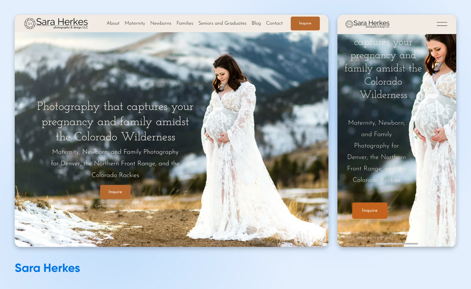
On Sara Herkes Photography’s website, both the visuals and the text tell you what this business offers, where, and for whom. This website offers a great example of how photographers can showcase their best work beautifully while also getting straight to the point about which kinds of clients they work with best.
2. Joshua Pestka Makes a Statement with Editorial Examples
Next, we have Joshua Pestka, who specializes in a totally different field than the last photographer.
Even without any explainer text, to the experienced eye, it’s easy to understand what Joshua does: editorial shoots.
It’s clear this website was created to speak to a specific kind of viewer. Likely, a brand owner or art director who lands here will see Joshua’s focus on (and talent for) editorial photography and further explore the site to learn more.

Portfolio Page: Time To Show Off!
Now for the section that most of us probably think of pretty quickly when it comes to a photography website: the portfolio!
What makes it so ubiquitous and, in our opinion, critical?
We like to think of your portfolio as a place to build on the tone your homepage already sets. It’s where people can dive even deeper into your style, and dig into the type of work and clients you specialize in — from family and weddings to corporate portraits, branding shots, large commercial projects, and so on.
A dedicated portfolio page gives you a singular, organized space in which to present your best work. For the most part, it’s helpful to the viewer to group galleries by category and showcase only your strongest images. So cull any images that feel dated, outside of your current style, or less sharp than current tech makes possible.
Of course, you don’t need to save all your work just for this page or section. We still recommend weaving examples of your work into other key areas of your site, like your home page or about page (more on this one soon). In the internet world, you never know how someone will first discover your site,so adding images tastefully throughout still offers a quick visual taste of your photography and further encourages people to explore further.
On that note, let’s view how two artists with distinctly unique styles tackle their portfolios.
3. Tegan K Studios Puts Their Best Photos Forward
Tegan K’s skill in product photography shines in this section of their website, fully devoted to pictures of textiles and crafts.
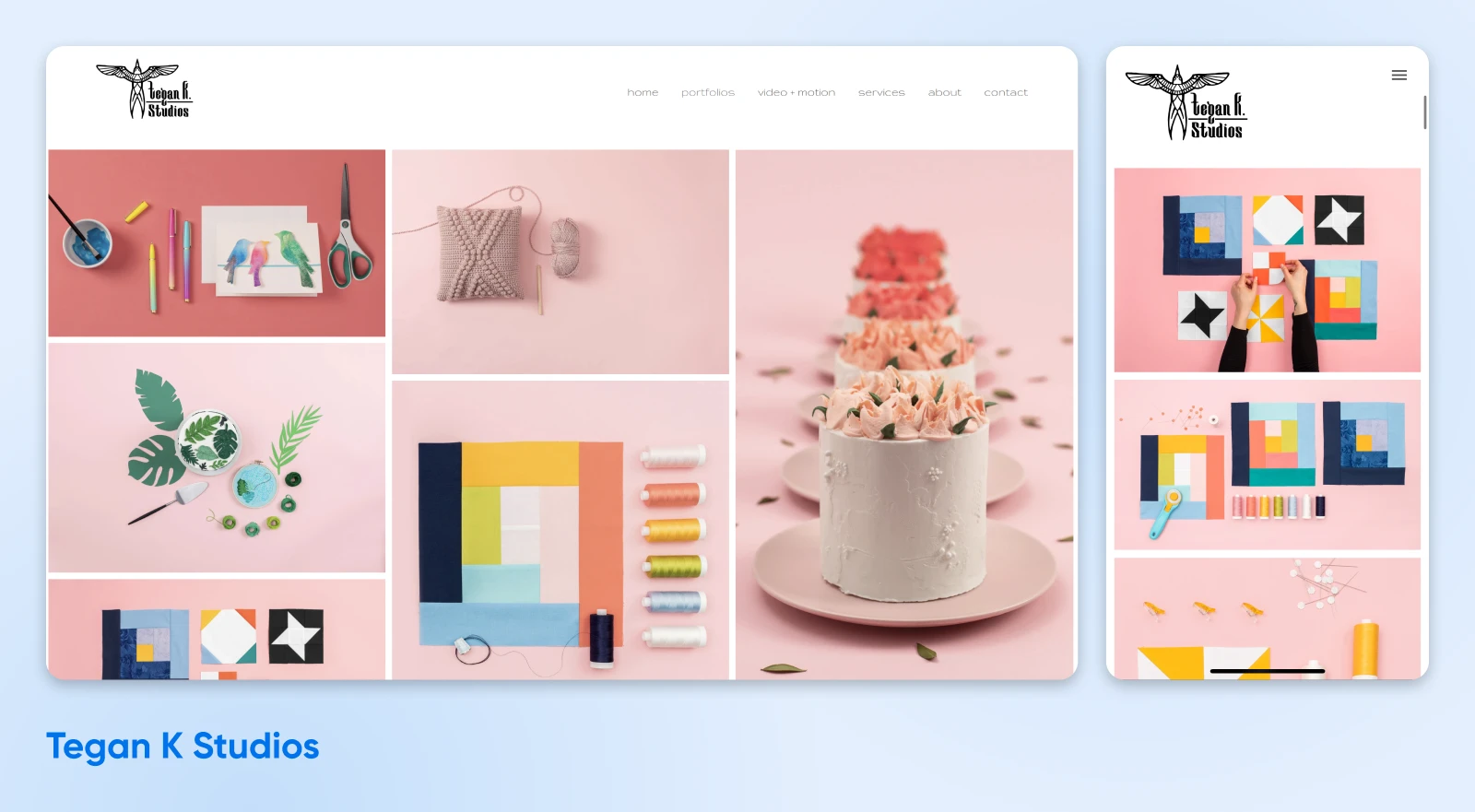
Every photographer will approach composition and capturing texture differently, and Tegan illustrates their expertise with both through this section of their portfolio. It’s a great example of this helpful advice found on one of Reddit’s largest photography subreddits:
Commentbyu/drew_ from discussioninphotography
4. Venezia Photography’s Film Focus Shines Through
That said, we also have Venezia Photography’s portfolio section chock full of beautiful film photos of Colorado.
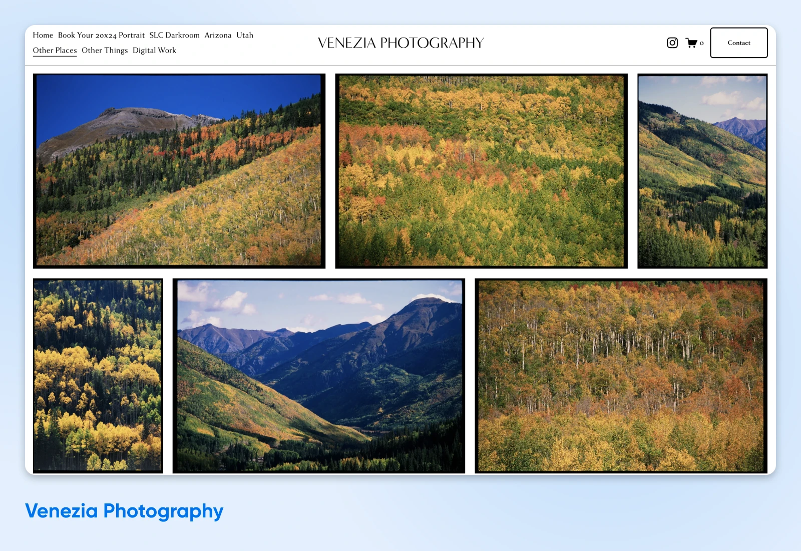
It technically goes against the previous advice about ruthlessly editing down your portfolio. However, we think it works because it perfectly emphasizes Venezia’s style. Their business is film-focused, a little old school, and meant to appeal more to creatives with a passion for the art versus buttoned-up corporate or budget shoppers.
The lesson here is one as old as time: learn the best practices first, then figure out where you can and should break them to stand out and express yourself best.
Services Page: Where Clarity and Concision Reign
And now we have what may be one of the more boring — but still totally necessary —website sections all photographers should be thinking about.
The “Services” page (or “Investment” or “Offerings” or…).
Whatever language best suits you and your audience, this page is key to converting casual browsers into paying customers.
Structure and transparency are of the utmost importance here. A thoughtful layout makes it easy for people to understand your packages, pricing, and what they can expect when it comes time to partner with you on their project.
Wait…
*record scratch*
Pricing?!
Yes, we fully recommend being upfront about your pricing. This not only communicates your integrity as an artist and professional, but it also weeds out “tire kickers” so you can devote your attention to converting serious inquiries. Add strong calls-to-action (CTAs) — buttons that say things like “Contact Me” or “Book Now” —to every package to guide visitors to their next step.
Other things you can include to make this section even more helpful and conversion-focused are testimonials from happy clients and answers to FAQs about your process or booking a shoot.
Next up, two different takes on service offerings from two very talented photography pros.
5. Jade Nikkole Photography Spells Out Each Package
Jade Nikkole is very specific when it comes to the packages they offer. Each has a clear title, description of what’s included, and most also include a button the reader can use to flow right into the booking process once they’ve found their perfect fit.
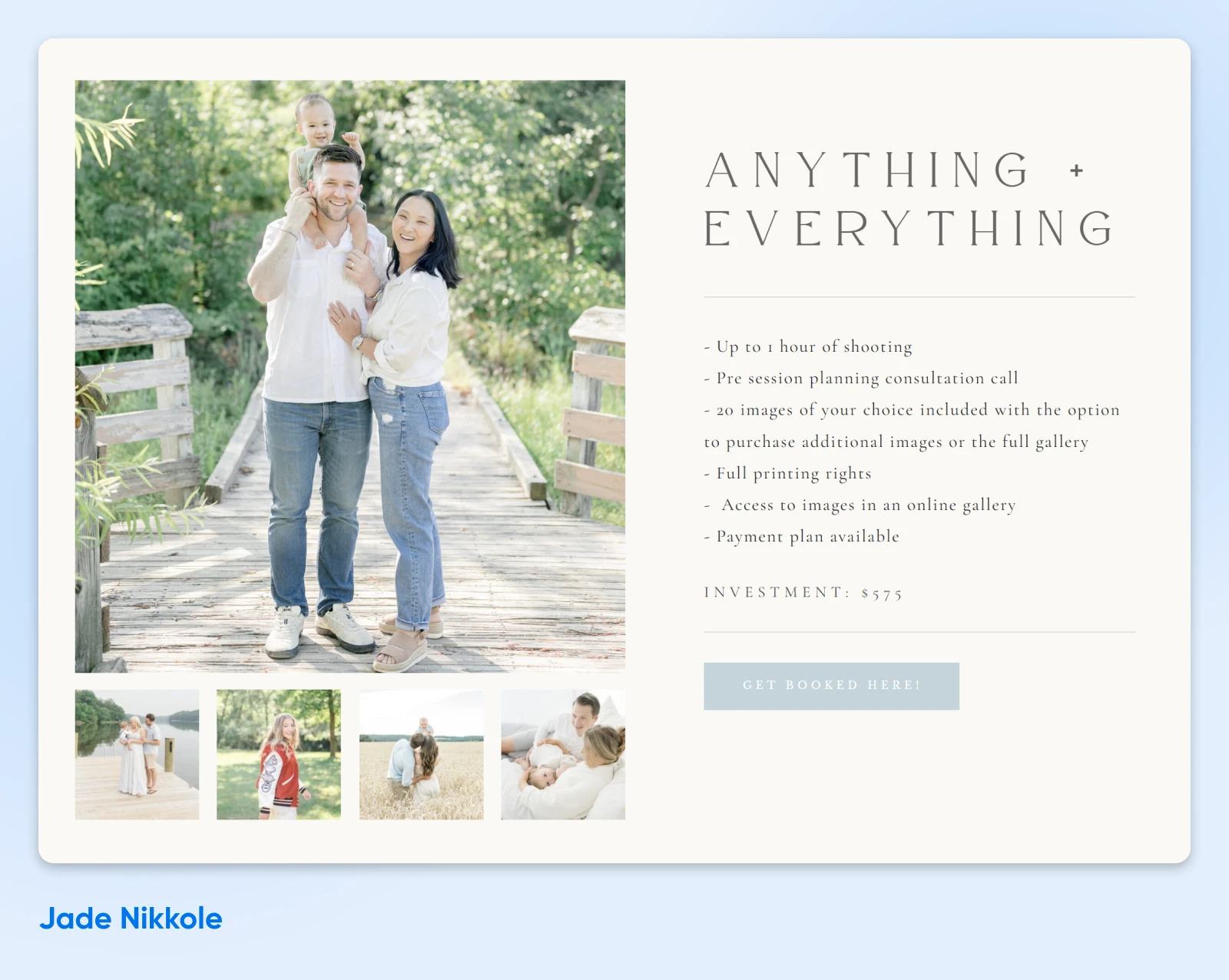
It can seem counterintuitive to “scare off” site visitors with this level of detail and directness, but actually, it makes it easier for folks who are ready to commit to get the ball rolling. And, it means less time spent going back and forth with people who have little chance of becoming paying clients!
6. Dennis Webber Photography Offers Simplified Pricing
Dennis Webber is similarly direct when explaining their wedding services. The big difference here is they’ve chosen to go with an even simpler pricing structure —one basic fee with incidentals.
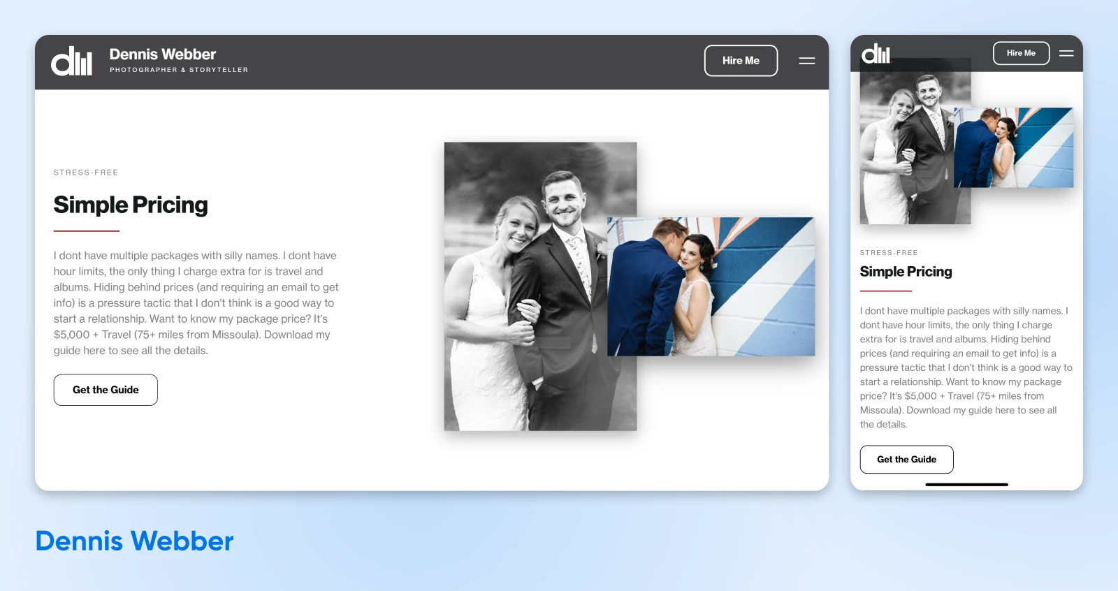
What draws us to this page, besides its distinct clarity, is its structure. The photographer understands that their price can seem a little high at first, so they get ahead of the questions and concerns by including lots of helpful information, including samples, a testimonial, a breakdown of what’s included for the price, and even a “Why choose me?” section.
According to one Reddit user, “Beyond looking pretty, it has a great copywriting structure. He answers the questions and objections in a potential client’s head as they scroll down the page. Really worth reading through carefully and thinking about what each section does.
“Why should I hire you?” > Reasons“How much do you cost?” > Pricing“Can I see your work?” > Gallery“Okay, I’m sold. How do I hire you?” > Book a consultation
Then you can adapt that structure to your website.”
About Page: Present Your Personality + Process
Many people book photographers for important life moments: weddings, births, graduations, etc. As such, being able to make a personal connection that tells them you’ll make them comfortable on this momentous occasion is huge.
Enter the “About You” section of your website.
This can be a tough area to get right for someone who’s used to being behind the camera, but trust us, it’s pretty important in making you feel trustworthy, no matter what type of audience you’re speaking to.
You don’t have to spill it all, but consider including a mix of both personal and professional details. Think about what a curious new visitor would want to know. What life events led you to photography? Where does your expertise lie? Where are you from, and what’s your favorite activity outside of work?
Unique details help you feel not just more approachable, but more memorable in a sea of faces. And once you’re done sharing, drop a few links to guide visitors to explore more of your website —portfolio, services, and beyond. Now that they have the warm and fuzzies, and feel more connected to the human behind the brand, they’re more likely to dig deeper.
Once again, we tracked down two successful artists who take their about pages in wholly unique and interesting directions that are perfect for their respective fields.
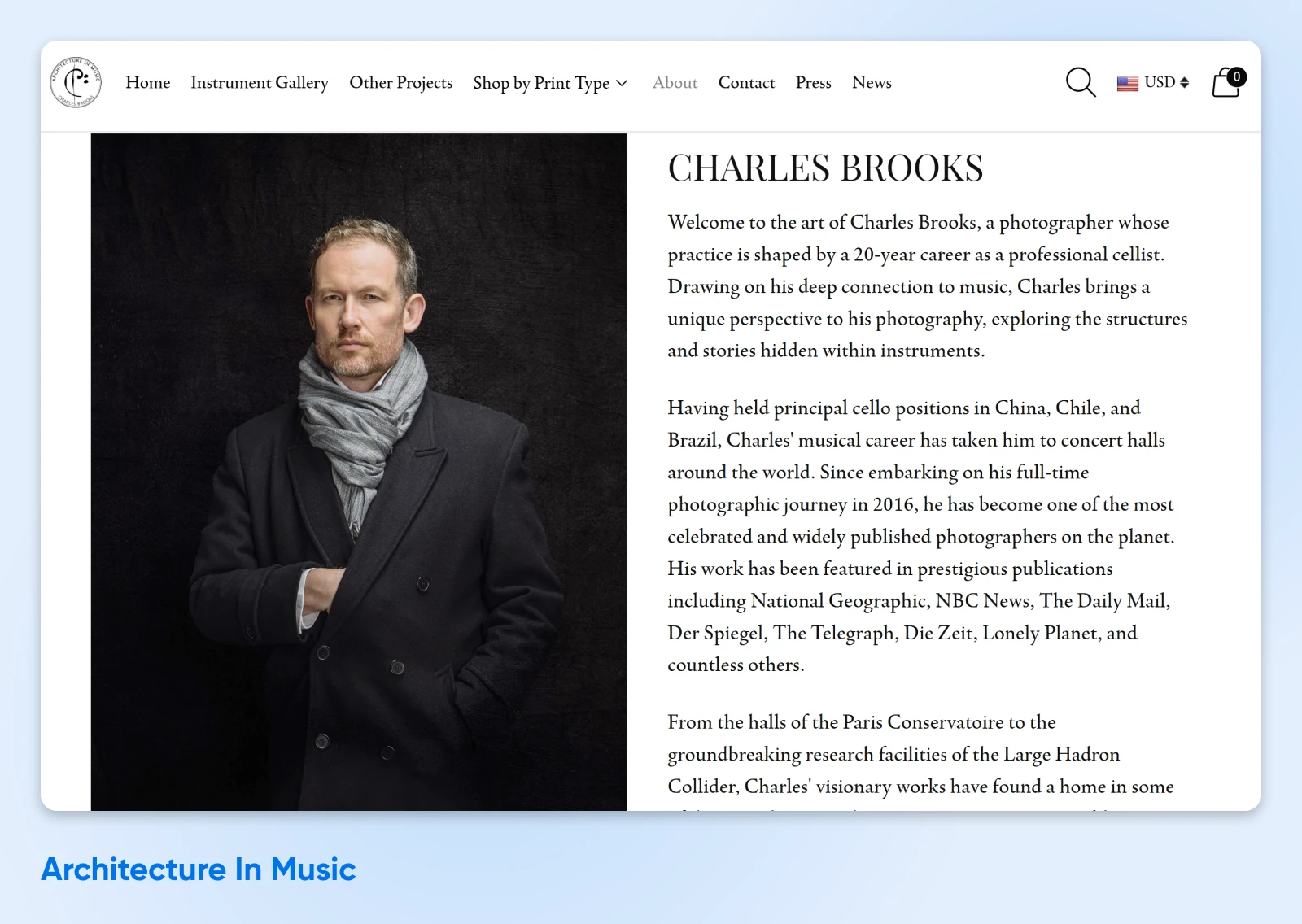
7. Architecture In Music Reveals the Talent Behind the Brand
The “About” page at Architecture In Music is especially critical for helping visitors understand the person behind the brand. Their unique experience as a musician clearly informs their photographic work and makes owning one of their pieces even more desirable for music fans.
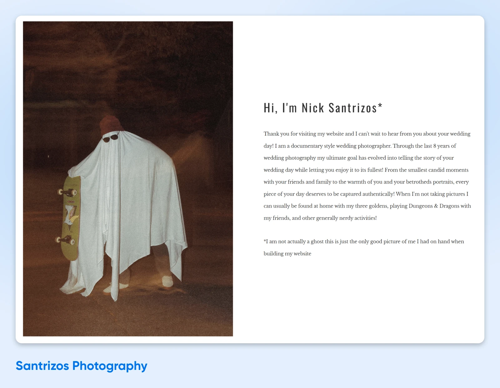
8. Santrizos Photography Takes a Lighthearted Approach
On the other end of the spectrum, we have Nick Santrizos, with an “About” page featuring a friendly description, playful photos, and inclusive language that paint a vivid picture of the kind of experience clients can expect after booking. It’s obvious who their target audience is, and it provides a helpful example for lifestyle-focused photographers who want to optimize their approachability.
Booking Page: Reduce Friction To Seal the Deal
Let’s talk about one more key element every successful photography website must include: the booking page.
After reviewing tons of sites, it seems like most go with a catch-all “Contact” page where people can enter some information, and the photographer will get back to them to work out the details and set the schedule.
If this is also the path you choose, it should feel relatively effortless for users.
You want your form to be as short as possible and straightforward. You may want information like their name, contact information, and a space for any extra information they want to send. This is also another great place (along with your “About” page) to add your business contact information, social channels, and even your location if you have a studio they might need to visit.
Naturally, this page should be ultra-easy to find, load quickly, and look great on mobile devices as well as desktops. Include just a bit of background information if you see fit, as this page is likely what you’ll often share on social media and at events —and therefore may influence visitors’ first impression of you.
Lastly, it can be helpful to ask what kind of session they’re interested in if you offer different styles. Be careful about making this a required field to fill out, as this can put a damper on interest from folks who are still just doing research.
With all that in mind, let’s visit a few photographers to see how it’s done in the real world.
9. DonDré Photography Is Easy To Contact
DonDré Photography wants you to know they’re always just a few clicks away.
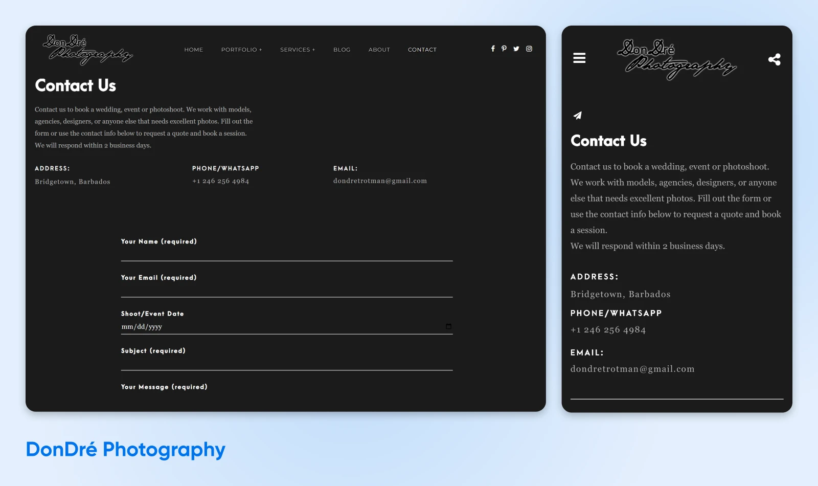
In addition to a short contact form, they also give easy-to-use contact details and a promise to respond quickly. Especially for photographers looking to grow from a side hustle to a full-time business, attention to customer service like this can lead to paying projects.
10. Alicia Osborne Photography Just Wants the Basics
Alicia Osborne Photography also keeps it short and sweet on her contact form. They ask a few clarifying questions, but don’t make them required — this helps reduce friction, so more people end up submitting the form.
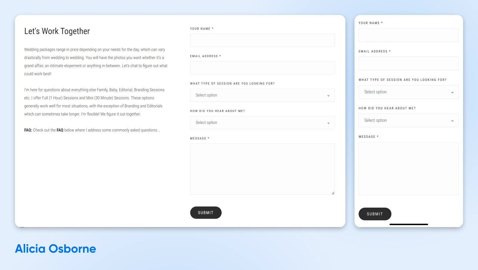
Outside of the form, this page also features a little bit of information about the services the photographer provides, as well as detailed answers to FAQs about gear, types of shoots, and more. This isn’t just great for SEO reasons, but it can also help people find their own information and go from potential client to booked reservation a lot quicker.
[BONUS] Blog: Reach a Wider Audience Through SEO
We’ve arrived at our last but not least section that many photographers don’t think about, but probably should.
It’s all about the blog, baby.
A written blog might not seem like a natural fit for a visual arena like photography, but it’s actually pretty pivotal to getting discovered by more people in the algorithmic age.
Search engines today look for a vast variety of things when choosing what order to display results in —including website speed, mobile friendliness, etc. —but one of the big players is still relevance, freshness, and quality of content.
This is where search engine optimization (SEO) comes in.
When planning blog content, focus on topics that interest your ideal clients and align with what people are searching for online. There are various ways to figure this out. Type “photography” into your search engine to see what phrase it automatically completes — and what the results show. Use Google Trends or a similar tool. You can even check out social media, forums, and competitors’ websites to see what’s going on in the photography world that you can add to.
Blogging doesn’t have to be complicated or create a ton of additional work. Don’t just take our word for it — keep scrolling to see two examples of how photography companies naturally created content around topics that were already relevant to them.
11. Britt Fowler Photography Understands SEO
As a photographer in the Des Moines area, Britt Fowler Photography did something clever —they wrote a blog post about wedding venues in the area where they shoot weddings!

We give this business an “A” for understanding how to create content around topics that naturally fit into their offerings. What would make it an “A+”? If they had included some of their own photos and a call to action to get readers to visit their booking page!
12. Schaefer Photography Turns Branding Project Into Unique Content
We don’t know what came first — the idea to get a neon sign made or the idea to turn the process into a blog post —but either way, the result is a great opportunity for SEO and showing off some unique photography skills.
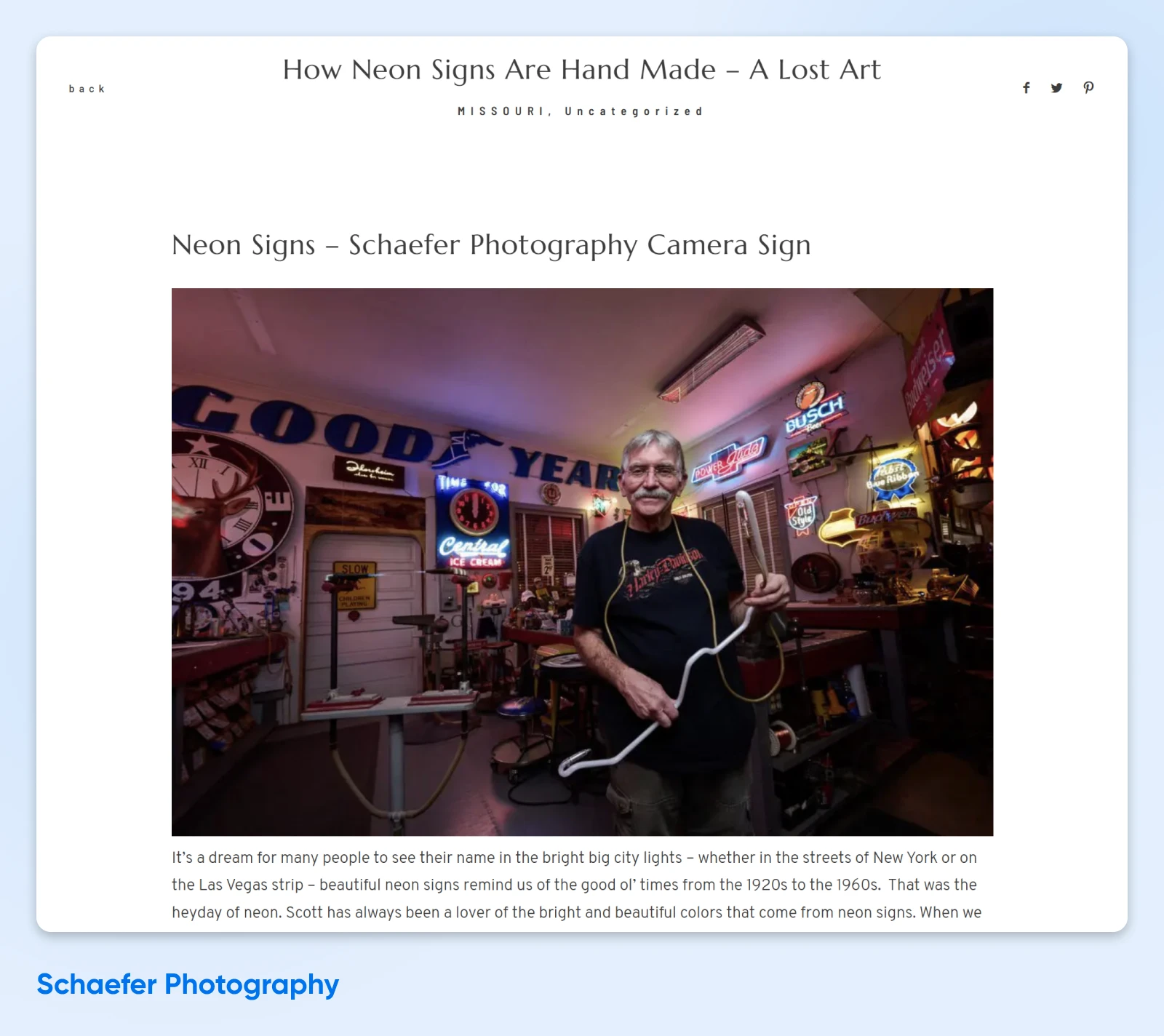
This post by Schaefer Photography is an excellent example of how photographers can work with other small businesses to drive both local and online traffic from people looking for their respective services.
And you know what’s best of all? The big “Contact Us” button at the bottom of the post that encourages potential clients to take the next step and engage with the business.
Lens the Fun Begin: Get Started With the Right Website Platform + Host
We just want to leave you with one final and very important note: The website platform and host you choose for your site does matter.
This is crucial for reducing bounce rates by boosting speed and user-friendliness. And it’s also a factor when considering security and how easy it is for you to update your site on the backend!
We know plenty of creatives, and one thing they all have in common is that they want to spend less time on the boring business bits and more time, well, creating.
If you’re in the same boat, DreamHost may make for a dreamy business partner.
DreamHost features several WordPress hosting plans. In addition to setting up WordPress for you, every plan means a fast and secure website, and support from a team of experts with years of WordPress experience. We choose to work with WordPress because of the mix of great functionality with easy customization.
To get a photography website up and running astonishingly quickly, check out our AI-powered Liftoff Website Builder. Want a more methodical approach? We can also help with custom web design. Got a site that just needs to be migrated over from another host? We can help there, too — for free.
Bring your photography dream into focus with help from DreamHost.

Pro Services – Web Design
DreamHost Makes Web Design Easy
Our designers can create a gorgeous website from SCRATCH to perfectly match your brand and vision — all coded with WordPress so you can manage your content going forward.
Learn More
Did you enjoy this article?